Quiksip Drink Packaging by Kush Kaveh |
Home > Winners > #160064 |
 |
|
||||
| DESIGN DETAILS | |||||
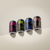
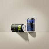
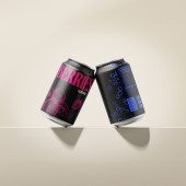
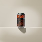
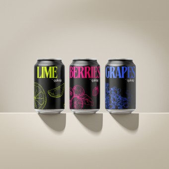
| DESIGN NAME: Quiksip PRIMARY FUNCTION: Drink Packaging INSPIRATION: Quiksip's design roots in a profound appreciation for fruit's natural allure, distilled to its core in our packaging. Beyond trends, The design resonates with a new generation's ethos: authenticity, clarity, and minimalism. The monochromatic, high-contrast visuals and uncluttered typography foster a genuine bond with discerning consumers, mirroring their preference for the unadorned truth in both flavor and design. UNIQUE PROPERTIES / PROJECT DESCRIPTION: Quiksip's packaging design masterfully encapsulates the pure essence of fruit with its bold, monochromatic color scheme, guaranteeing an eye-catching presence on any shelf. The design's minimalist ethos, characterized by sharp contrasts and dynamic illustrations, forms a direct bond with consumers who value genuine simplicity and authenticity. More than just aesthetically pleasing, the stark, high-contrast visuals serve as a powerful testament to Quiksip's dedication to excellence and purity in the competitive marketplace. OPERATION / FLOW / INTERACTION: The Quiksip can is designed for intuitive use, with a simple pull-tab mechanism for opening. This universal interaction ensures ease of access to the beverage, making it approachable for a wide audience. The design's visual cues, such as the vivid fruit illustrations and color coding, guide the user's choice, allowing for quick identification of flavors. The lightweight, ergonomic form factor of the can enhances the drinking experience, ensuring comfort and satisfaction. Quiksip's design facilitates a seamless transition from the consumer's initial visual attraction to the physical act of enjoying the drink, optimizing both functionality and aesthetic appeal. PROJECT DURATION AND LOCATION: The Quiksip project was initiated and completed within the timeframe of January to February 2024 in Izmir, Turkey. This design endeavor was crafted for a client based in Orange County, California. The project's swift execution over two months reflects an efficient design process, showcasing the ability to deliver high-quality, impactful packaging solutions in a standard amount of time. This international collaboration underscores the global reach and appeal of the Quiksip brand and its packaging design. FITS BEST INTO CATEGORY: Packaging Design |
PRODUCTION / REALIZATION TECHNOLOGY: Quiksip's packaging was realized through state-of-the-art digital printing technology, allowing for crisp, vibrant graphics that maintain fidelity to the original design intent. The use of eco-friendly inks and recyclable aluminum materials reflects a commitment to sustainability. Precision in the printing process ensures that each can's illustration is not only visually impactful but also resistant to wear from handling and refrigeration. SPECIFICATIONS / TECHNICAL PROPERTIES: The Quiksip beverage packaging follows the standard dimensions of a Coca-Cola can, measuring 66mm in diameter by 125mm in height, reflecting a standard 330ml volume capacity. The cans are made from lightweight yet durable aluminum, ensuring both portability and sustainability. This size is chosen for its convenience and familiarity among consumers, fitting comfortably in hand and in standard cup holders. TAGS: Minimalist Beverage Packaging, Sustainable Design, Eco-Friendly Materials, Bold Monochromatic Aesthetics, Consumer Engagement, Flavor Visualization, Intuitive User Experience, Modern Design Trends, Environmental Sustainability, Beverage Industry Innovation RESEARCH ABSTRACT: The Quiksip project embarked on qualitative research to understand consumer preferences in beverage packaging. Objectives centered on identifying key factors influencing purchase decisions, with a methodology that combined surveys and focus groups. Tools included online survey platforms and in-person discussion sessions, involving participants ranging from young adults to middle-aged consumers. CHALLENGE: The primary challenge in the Quiksip design project was striking a balance between aesthetic appeal and practical functionality, within the constraints of sustainable production methods. Navigating the historical and social expectations for beverage packaging, while also adhering to current environmental regulations, posed a significant hurdle. Internally, Wrestled with creating a visually distinctive design that could stand out in a saturated market without compromising on eco-friendliness. ADDED DATE: 2024-02-28 21:02:54 TEAM MEMBERS (1) : Kush Kaveh IMAGE CREDITS: Designer Kush Kaveh, Quiksip Can Design, 2024. |
||||
| Visit the following page to learn more: https://kushkaveh.com/portfolio/quiksip | |||||
| AWARD DETAILS | |
 |
Quiksip Drink Packaging by Kush Kaveh is Winner in Packaging Design Category, 2023 - 2024.· Read the interview with designer Kush Kaveh for design Quiksip here.· Press Members: Login or Register to request an exclusive interview with Kush Kaveh. · Click here to register inorder to view the profile and other works by Kush Kaveh. |
| SOCIAL |
| + Add to Likes / Favorites | Send to My Email | Comment | Testimonials | View Press-Release | Press Kit |
| COMMENTS | ||||||||||||
|
||||||||||||
Did you like Kush Kaveh's Packaging Design?
You will most likely enjoy other award winning packaging design as well.
Click here to view more Award Winning Packaging Design.


