|
|
|

|
|
| DESIGN DETAILS |
DESIGN NAME:
Hao Prawns
PRIMARY FUNCTION:
Seasoning Packaging
INSPIRATION:
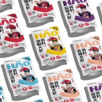
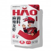
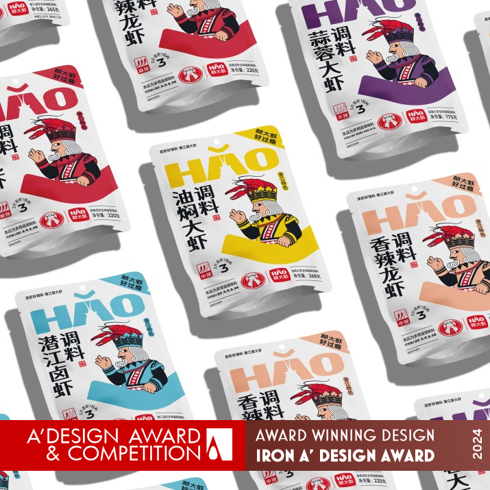
This is a seasoning for stir frying crayfish. Crayfish is a favorite food among people. The designer has observed that people enjoy playing poker after eating crayfish, and the people on the cards are very familiar elements. The designer combines crayfish and poker together, making people feel familiar and friendly at first glance, and can also see the product properties at a glance.
UNIQUE PROPERTIES / PROJECT DESCRIPTION:
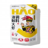
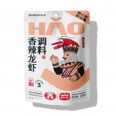
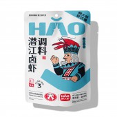
This is a series of crayfish seasoning products. Most similar products in supermarkets are mainly in red. Designers use white bags to make people's first impression of this product healthier. At the same time, they have designed an IP image. Through the combination of familiar playing cards and crayfish, people can quickly develop a sense of familiarity and understand the product properties at a glance. This combination makes the product more memorable.
OPERATION / FLOW / INTERACTION:
On most shelves with red products, white is very easy to see, and designers use familiar poker characters and crayfish patterns that are easy to understand at a glance. At the same time, designing logo English characters in the form of Chinese pinyin annotations helps people correctly read the first rare Chinese character in the product name, which helps promote the brand. At the same time, this pinyin annotation "HAO" adds tone, becoming an auxiliary graphic for the brand.
PROJECT DURATION AND LOCATION:
The project started in Wuhan, China in July 2023 and was completed in Wuhan, China in August 2023. It is expected to be sold in Hubei, China in March 2024.
FITS BEST INTO CATEGORY:
Packaging Design
|
PRODUCTION / REALIZATION TECHNOLOGY:
For better product preservation, these series of products are sealed with aluminum foil bags, with a matte film covering the surface for a more textured feel.
SPECIFICATIONS / TECHNICAL PROPERTIES:
Width 185mm x Depth 45mm x Height 256mm
TAGS:
Packaging design, Hao Prawns, Seasoning, illustration, Chinese design, Wuhan Sanbu brand design
RESEARCH ABSTRACT:
These series of products are mostly purchased by consumers in supermarkets, so designers went to many supermarkets and looked at the shelves of the same type of products. They conducted research from different perspectives, and found that in order to break through, the first thing is to have a sense of jumping in color, making it easier for people to find. In addition, it is necessary to have elements that are familiar to people but different from other brands, in order to make consumers remember.
CHALLENGE:
This is a commonly used seasoning in people's daily lives, and the biggest challenge in design is not to use the designer's perspective, but to use the consumer's perspective, starting from health, differentiation, and easy to find second time purchases. So designers need to constantly play the role of consumers and ponder the psychological state of consumption.
ADDED DATE:
2023-09-27 11:15:31
TEAM MEMBERS (1) :
IMAGE CREDITS:
Jin Zhang, 2023.
|
| Visit the following page to learn more: http://www.sanbu.cc |
|
| CLIENT/STUDIO/BRAND DETAILS |
 |
NAME:
Wuhan Sanbu Brand Design
PROFILE:
Wuhan SANBU Brand Design focuses on providing customers with full brand design and product packaging design services. In the constant upgrading of the consumer market, Sanbu always aims to "making designs that convey feelings", uses culture and emotion to influence and touch consumers, and reshapes the brand and product packaging design that subverts convention and makes people fall in love at first sight for many consumer product enterprises. Services include: liquor, food, tea, coffee, dairy, catering, agricultural tourism, home furnishing, education and training, clothing and other fields, including Yellow Crane Tower, Yingbo Jinlongquan Beer, TsingTao Beer, Lijiang Shanlan Wine, Jiangjun Red Wine, etc.
|
|
|
| COMMENTS |
| Giulia Esposito |
Comment #100079 on June 22, 2024, 2:22 am |
|
Exploring the innovative realm of packaging design, I recently encountered a remarkable piece that brilliantly merges the worlds of culinary delight and casual entertainment. This ingenious work, a packaging design for a series of crayfish seasoning, stands out not only for its aesthetic appeal but also for its deep understanding of consumer behavior and preferences. The choice to deviate from the conventional red packaging of similar products to a cleaner, more health-conscious white, immediately draws attention, setting a fresh and inviting tone. The integration of familiar playing cards with crayfish not only captures the essence of the dining experience but also solidifies brand recognition, making it a memorable encounter for consumers. By venturing into supermarkets and analyzing the competitive landscape, the design team has effectively employed color contrast and relatable imagery to ensure the product leaps off the shelf and into the consumer's basket. The packaging itself, sealed with aluminum foil and coated with a matte film, not only speaks to the product's quality but also to its commitment to preserving freshness. This approach to design, prioritizing the consumer's perspective on health, uniqueness, and ease of repeat purchase, showcases a profound understanding of the market's needs and desires. The biggest triumph, however, lies in transforming a commonly used seasoning into a standout product that invites engagement and curiosity, a testament to the creative brilliance and consumer-centric approach of Jin Zhang.
|
| Elisabeth Clark |
Comment #101289 on June 22, 2024, 6:24 am |
|
It is with great admiration that I reflect upon Jin Zhang's exceptional work on "Hao Prawns" seasoning packaging, which has rightfully earned the prestigious A' Design Award in the Packaging Design category. The innovative approach of employing a white color scheme diverges from the conventional red, imbuing the product with a fresh and healthy perception that instantly engages consumers. The creative integration of familiar playing cards with crayfish not only establishes an immediate connection with the audience but also enhances the memorability of the product through its unique and friendly IP image. This clever combination allows the essence of the product to be communicated swiftly and effectively, showcasing Zhang's profound understanding of consumer behavior and market dynamics. Furthermore, the extensive research conducted in supermarkets to identify and implement a distinctive color and thematic differentiation speaks volumes of the meticulous and thoughtful process behind the design. This work not only exemplifies good design but also sets a benchmark in packaging innovation, making it a source of inspiration for designers and enthusiasts alike. Jin Zhang's ability to transform ordinary packaging into an extraordinary consumer experience is truly commendable, marking "Hao Prawns" as a paragon of creative excellence in the realm of packaging design.
|
| Mark Allen |
Comment #102509 on June 22, 2024, 10:28 am |
|
Congratulations on winning the A' Design Award in the Packaging Design Category for the "Hao Prawns" Seasoning Packaging. The innovative approach of using white bags to differentiate and promote a healthier image in a market saturated with red packaging is truly commendable. The clever incorporation of an IP image that blends the familiar elements of playing cards with crayfish not only captures the essence of the product but also fosters a quick and memorable connection with consumers. This design successfully balances aesthetics with consumer psychology, making it not just a packaging design, but a remarkable example of how design can influence purchasing decisions and brand recall. The meticulous research and consumer-centric approach taken to overcome the challenges in design execution showcases a deep understanding of the market. The choice of materials and production methods further emphasizes the commitment to quality and sustainability. This award is a well-deserved recognition of creativity, research, and strategic thinking in packaging design.
|
|
|
Did you like Jin Zhang's Packaging Design?
You will most likely enjoy other award winning packaging design as well.
Click here to view more Award Winning Packaging Design.
Did you like Hao Prawns Seasoning Packaging? Help us create a global awareness for good packaging design worldwide. Show your support for Jin Zhang, the creator of great packaging design by gifting them a nomination ticket so that we could promote more of their great packaging design works.
|
|

|
|
|
|
