Solar Serenity Commercial Spaces by Yun Chien Tsai |
Home > Winners > #153069 |
 |
|
||||
| DESIGN DETAILS | |||||
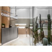
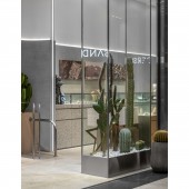
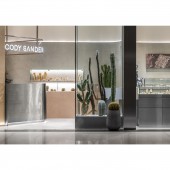
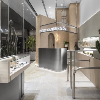
| DESIGN NAME: Solar Serenity PRIMARY FUNCTION: Commercial Spaces INSPIRATION: In the design, we pay special attention to the incorporation of adobe bricks, with their layered architectural style, seamlessly integrating various functions such as the main walls, counters, storage rooms, and changing rooms. By utilizing varied heights and strategic arrangement, we create a distinctive spatial experience that immerses individuals in the ambiance of warmth and enthusiasm, reminiscent of the sunny atmosphere in New Mexico, USA. This innovative spatial layout not only enhances functionality but also serves as a reflection of the brand's innovative and unique spirit. UNIQUE PROPERTIES / PROJECT DESCRIPTION: Transplanting the Spanish style adobe brick architecture from Santa Fe into a department store creates a unique and distinctive spatial experience. Drawing inspiration from adobe brick buildings, we create a layered and stacked three-dimensional effect, as if a house is embedded within the mall. This unique design will capture the attention of customers and immerse them in a shopping atmosphere that stands out from the crowd. OPERATION / FLOW / INTERACTION: In terms of material selection, we primarily utilize a sandstone series as the main theme, including wall paint, floor tiles, and decorative elements such as cactus, to create an overall desert-style ambiance. PROJECT DURATION AND LOCATION: TAIPEI,2022 FITS BEST INTO CATEGORY: Interior Space and Exhibition Design |
PRODUCTION / REALIZATION TECHNOLOGY: We focus on using different materials to enhance creativity and visual effects. Brick Architecture is a core element in the design, creating a layered and three dimensional effect that establishes a unique atmosphere within the mall. The natural color tones and texture of adobe bricks bring warmth and a sense of familiarity, aligning with the brand's positioning and theme. Cleverly incorporate stainless steel material in the design of display counters and windows. Stainless steel adds a modern and stylish touch, elevating the overall design with a touch of sophistication. The contrast between stainless steel and adobe bricks creates unique visual depth and diversity. Utilize horizontal linear lighting strips to divide the vertical layers and highlight the main walls. The lighting strips' projection and illumination effects enhance the spatial depth and create a dynamic and dramatic design. In addition to stainless steel, we also emphasize the metallic tones of the brand's accessories. By incorporating metal elements like stainless steel pipes and tables, we infuse a sense of futurism and trendiness. The glossy and cool characteristics of metal contrast with the warm texture of adobe bricks, highlighting the brand's personality and uniqueness. SPECIFICATIONS / TECHNICAL PROPERTIES: 50 square meters TAGS: Cultural Fusion, Natural Textures, Sustainable, Dynamic RESEARCH ABSTRACT: The design aims to fully encapsulate the brand's rich history within the space, allowing customers to directly experience the essence of the brand. Additionally, the sales flow is optimized to cater to different customer segments, with two distinct pathways offering comprehensive service areas. CHALLENGE: In this design project, we had to overcome regulatory challenges when making material selections. We made certain adjustments in curved wall surfaces and paint applications to ensure that the design could harmonize with construction requirements while still delivering a visually pleasing result. ADDED DATE: 2023-06-29 17:05:15 TEAM MEMBERS (1) : IMAGE CREDITS: Dean Cheng |
||||
| Visit the following page to learn more: https://www.behance.net/tsaiyc | |||||
| AWARD DETAILS | |
 |
Solar Serenity Commercial Spaces by Yun Chien Tsai is Winner in Interior Space and Exhibition Design Category, 2023 - 2024.· Read the interview with designer Yun Chien Tsai for design Solar Serenity here.· Press Members: Login or Register to request an exclusive interview with Yun Chien Tsai. · Click here to register inorder to view the profile and other works by Yun Chien Tsai. |
| SOCIAL |
| + Add to Likes / Favorites | Send to My Email | Comment | Testimonials | View Press-Release | Press Kit |
Did you like Yun Chien Tsai's Interior Design?
You will most likely enjoy other award winning interior design as well.
Click here to view more Award Winning Interior Design.


