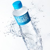
Suoyirun Water Packaging by Tiger Pan |
Home > Winners > #152965 |
 |
|
||||
| DESIGN DETAILS | |||||
| DESIGN NAME: Suoyirun PRIMARY FUNCTION: Water Packaging INSPIRATION: The inspiration comes from phonology, which is the process of visualizing sound through the vibration of sand or water and other media. Each vibration wave has its unique corresponding waveform pattern. As the frequency of sound wave increases, the physical pattern displayed becomes more and more complex and fine. Bottle type texture from the music noise and ripple caused by the vibration of the water, according to the frequency from shallow to deep natural gradient, which was created by the sound of form, the invisible becomes visible, to see the sound is like, refraction between surface and surface caused by the brand-new visual shock Wei, but also show the sparkling under the sunlight. UNIQUE PROPERTIES / PROJECT DESCRIPTION: Suoyirun is a natural mineral water brand. It comes from Changbai Mountain, a world-class gold water source at 36-46 degrees north latitude. It is rich in a variety of natural minerals and trace elements. Because the total hardness of water is only 90-120mg/L (the national standard total hardness is less than 150mg/L for soft water), Suoyirun stands out. OPERATION / FLOW / INTERACTION: The entire design concept is centered around water, with the curvature of the bottle resembling a comforting feeling to hold. The "Suoyirun" font design aims to convey the fluidity of water, while the brushstrokes strive for ultimate comfort. Attention to detail enhances perceptual accuracy, allowing the brand to stand out within the limited space of the bottle label. The label features blue wave shading, with varying depths to mimic the undulating shape of water. The hourglass figure of the bottle conforms to ergonomic principles. In the words of British horticulturalist and architect William Kent, "nature abhors straight lines." This natural dynamism, akin to a slender waist, exudes elegance and draws people in with its gentle yet compelling allure. Whether it's the 550ml or the 350ml variant, both boys and girls can hold it snugly. PROJECT DURATION AND LOCATION: Project duration and location: The project will start in Shenzhen in July 2022, be completed in Shenzhen in May 2023, and be exhibited at the Food and Beverage Innovation Forum in June 2023. FITS BEST INTO CATEGORY: Packaging Design |
PRODUCTION / REALIZATION TECHNOLOGY: UV and hot silver processes are used on the matte film, and the bottle cap is embossed with a logo to enhance the delicacy of the details, bringing consumers a dual sense of vision and touch. SPECIFICATIONS / TECHNICAL PROPERTIES: Diameter 70mm x Height 228mm TAGS: water, warm water, blue, Tigerpan RESEARCH ABSTRACT: In the Chinese bottled water market, the price of natural mineral water has remained high. Faced with the competition of product advantages from various brands in the existing market, the question they are contemplating this time is how to create differentiation through branding and packaging, and further strengthen the brand's inherent advantages and communication. Selling at a lower price to emerge victorious in the competitive water sales war is their current focus. CHALLENGE: Its innovation and differentiation lie in the reference of acoustics to the texture of the bottle body. In related research on acoustics, it has been shown that each vibration wave has its own unique corresponding wave pattern. Vibrations are used to visualize sound, and as the frequency of the sound waves increases, the physical patterns displayed become increasingly complex and refined. The strong vision is full of beautiful and poetic associations. Every ripple is like a soft string, white water splashes, beating rhythmic drums, big and small water waves, rippling on the clear water, Flowing into the hearts of every consumer and witness... ADDED DATE: 2023-06-29 06:53:51 TEAM MEMBERS (6) : Chief Designer: Tiger Pan, Designer: Wang Yahui, Technical Support: Xie Zhangkun, 3D Renderer: Zhu Yuling, Video Editing: Ma Chao and Project Manager: You Hua IMAGE CREDITS: Tiger Pan PATENTS/COPYRIGHTS: Tiger Pan |
||||
| Visit the following page to learn more: https://www.zcool.com.cn/work/ZNjUyMjg4M |
|||||
| AWARD DETAILS | |
 |
Suoyirun Water Packaging by Tiger Pan is Winner in Packaging Design Category, 2023 - 2024.· Read the interview with designer Tiger Pan for design Suoyirun here.· Press Members: Login or Register to request an exclusive interview with Tiger Pan. · Click here to register inorder to view the profile and other works by Tiger Pan. |
| SOCIAL |
| + Add to Likes / Favorites | Send to My Email | Comment | Testimonials | View Press-Release | Press Kit |
Did you like Tiger Pan's Packaging Design?
You will most likely enjoy other award winning packaging design as well.
Click here to view more Award Winning Packaging Design.


