DESIGN NAME:
Sweet Daily
PRIMARY FUNCTION:
Residential
INSPIRATION:
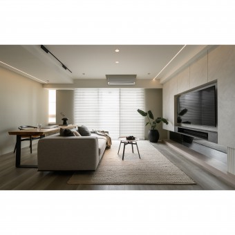
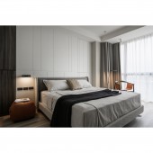
The client chose to relocate to a new location with plenty of greenery for the benefit of their children's education and growth. The designer reconfigured the layout and materials to optimize the interior lighting, ensuring that the top floor received ample natural light. The project features a minimalistic and cozy style, with beige and gray as the primary colors and wood grain accents. The overall design creates a sense of spaciousness and warmth. Children, in particular, will be able to immerse themselves in the sunshine and greenery of this environment, growing up in a pleasant atmosphere filled with fun and joy.
UNIQUE PROPERTIES / PROJECT DESCRIPTION:
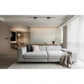
Minimalist Lighting: The designer utilized minimalist color blocking and facade design to showcase warm, soft daylight throughout every corner of the space. Unnecessary partitions were removed to extend the public area, allowing natural light to flow seamlessly from the balcony and living room to the dining room and walkway.
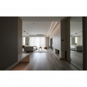
Intriguing Vista: To maximize the living space, the designer removed several partitions, including the foyer and study room, while ensuring there were interesting design elements at every possible vista. This design prompts family members to notice someone walking down the aisle or into the dining room.
OPERATION / FLOW / INTERACTION:
The project finally meets the client's needs perfectly and echoes the designer's initial design and planning. The minimalistic style and elegant wood tones are interwoven to create a cozy living for the family. At the same time, more lighting possibilities are arranged to create a unique color and light in the space. The rearranged layout is also closer to the family's daily habits, allowing them to enjoy a tranquil home that is comfortable, convenient, spacious, and refreshing.
PROJECT DURATION AND LOCATION:
The project finished in July 2022 in Taiwan.
FITS BEST INTO CATEGORY:
Interior Space and Exhibition Design
|
PRODUCTION / REALIZATION TECHNOLOGY:
Building materials: stone panel, eco-friendly latex paint, black mirror, glass, system cabinets, laminate flooring, etc. The building materials are selected according to the site conditions and the children's living habits. The whole room is made of moisture-resistant and anti-abrasion materials. The stone panel brings a good visual presentation, and its warm texture adds to the comfortable space under the daylight. In addition, the color scheme is low saturation tones, such as beige and gray, supplemented by wood grain brown as a highlight. The low saturation can bring a sense of tranquility and well set off the daylight.
SPECIFICATIONS / TECHNICAL PROPERTIES:
The site is a 10-year-old pre-owned apartment on the 14th floor with a total area of 105.7 square meters. There are 3 plus 1 rooms, a living room, and a dining room. The significant layout changes are the removal of the study room and foyer partition, and the widening of the dining room. By removing the study room partition, natural light can better illuminate the private walkway to achieve the visual effect of enlarging the space. The layout between the dining room and the second bedroom is redesigned to make the dining room more functional for daily use, and the second bedroom can have better routes.
TAGS:
Minimalist, higher floor, pre-owned apartment, grayscale, open plan.
RESEARCH ABSTRACT:
The pure color blocks and natural materials are stacked and matched to present a minimalist visual design. The natural materials reveal the delicate texture and the large grayscale color blocks can accentuate the warmth of daylight, showing the unique warm atmosphere in a minimalist style. In the cozy space plan, the designer re-planned the layout according to the living habits of the client's family, including the pre-operation of leveling the foundation and adjusting the route of the entrance to the private area.
CHALLENGE:
The site is a decade old, and after numerous occupants, the apartment has suffered slight damage and unevenness, with the wall surface being the most severely affected. As the project goal is to achieve a minimalistic and elegant aesthetic, the foundation work had to be meticulous and detailed. Despite the time-consuming process, a smooth and flat surface was achieved to enhance the diffusion of light from light to dark, complementing the minimalistic and cozy ambiance. Additionally, the layout planning was carefully executed to accommodate natural daylight and create a minimalist appearance with suitable modifications.
ADDED DATE:
2023-03-27 02:45:33
TEAM MEMBERS (1) :
-
IMAGE CREDITS:
DFCD Interior Design Studio
|


