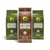
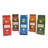
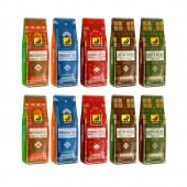
Waggner Coffee Packaging by Wallrus Design Studio |
Home > Winners > #151041 |
 |
|
||||
| DESIGN DETAILS | |||||
| DESIGN NAME: Waggner Coffee PRIMARY FUNCTION: Packaging INSPIRATION: Most of the coffee packages are simple and only the brand name is placed on them, which makes their designs repetitive on the store shelf. The consumer needs more than a name or brand. The design of Wagner packaging attracts the viewer's eye and is easily distinguishable on the shelf. UNIQUE PROPERTIES / PROJECT DESCRIPTION: The main design idea was based on the function of coffee. Waggner is a German brand. Coffee consumers are those who use coffee to meet their body's caffeine needs. Most of them stay up at night for work and sleep less hours. The brand logo shows a deer sitting in its house drinking coffee with a light on behind it. Using this idea and drawing old German wooden windows, Waggner's packaging design was formed. OPERATION / FLOW / INTERACTION: This design on the shelf is well distinguished from other products and impresses the consumers and establishes an emotional connection with them. PROJECT DURATION AND LOCATION: The project started in January 20221 in Iran and finished in April 2021 in Iran. FITS BEST INTO CATEGORY: Packaging Design |
PRODUCTION / REALIZATION TECHNOLOGY: This product is rotogravure-printing on metalized coffee pouch. SPECIFICATIONS / TECHNICAL PROPERTIES: Width 100 mm x Depth 70 mm x Height 280 mm TAGS: Coffee, Packaging, German product, Wallrus RESEARCH ABSTRACT: Examining familiar elements for audiences and consumers and presenting a questionnaire to consumers to find their insights on the way and reasons for coffee consumption. CHALLENGE: Attention to the origin of the brand and the use of familiar forms for the packaging audience ADDED DATE: 2023-03-25 12:51:19 TEAM MEMBERS (1) : Creative Director: Matin Mirzaei IMAGE CREDITS: Mockup: Wallrus Design Studio PATENTS/COPYRIGHTS: Mockup: Wallrus Design Studio |
||||
| Visit the following page to learn more: https://wallrusstudio.com | |||||
| AWARD DETAILS | |
 |
Waggner Coffee Packaging by Wallrus Design Studio is Winner in Packaging Design Category, 2022 - 2023.· Read the interview with designer Wallrus Design Studio for design Waggner Coffee here.· Press Members: Login or Register to request an exclusive interview with Wallrus Design Studio. · Click here to register inorder to view the profile and other works by Wallrus Design Studio. |
| SOCIAL |
| + Add to Likes / Favorites | Send to My Email | Comment | Testimonials | View Press-Release | Press Kit |
Did you like Wallrus Design Studio's Packaging Design?
You will most likely enjoy other award winning packaging design as well.
Click here to view more Award Winning Packaging Design.


