DESIGN NAME:
Nest
PRIMARY FUNCTION:
Dental Clinic
INSPIRATION:
The site is in the corner of a unique building. To enlarge the effectiveness of the commercial space more effectively, the designer elaborately created lighting and planning. According to its conditions, the designer installed large floor-to-ceiling windows at the entrance and moved the staircase forward to maximize the 270-degree lighting advantage. The building's round and elegant look, coupled with the good functionality of the nearby shopping area and a large number of pedestrians, made the project concept based on the image of a nest.
UNIQUE PROPERTIES / PROJECT DESCRIPTION:
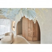
The Curves in Three Dimensions: All things in space have extraordinary meaning. The unique materials and curved surfaces form a distinctive visual experience. The three-dimensional curves in the interior create rhythm. The designer applied CNC punching, arranging, and assembling techniques to make each curve unique.
Unadorned Atmosphere: The interior is dominated by a light beige. The designer used mineral paint with delicate textures to create the organic curves of each wall. The handmade-textured gives the paint a flawless texture that is similar to human skin. The space also breathes like skin, creating a tranquil atmosphere.
OPERATION / FLOW / INTERACTION:
The planning of the project started with the entrance. Floor-to-ceiling windows are replaced with partitioned glass to facilitate lighting and marketing while meeting architectural conditions and constraints. The entrance is also redesigned. When visitors enter the space, the healing experience begins. In addition, the lighting creates a warm, comfortable atmosphere where the staff can perform treatments in an ideal setting and the patient can relax.
PROJECT DURATION AND LOCATION:
The project finished in February 2023 in Taiwan.
FITS BEST INTO CATEGORY:
Interior Space and Exhibition Design
|
PRODUCTION / REALIZATION TECHNOLOGY:
Building materials: solid wood, pebble dashing, rattan, glass, mineral paint, woodwork, dried flowers, light cement, etc. The color scheme is based on the concept of 'natural' and 'pure'. The light cement, which is particle-free, pressure-resistant, and matte, is used to create seamless flooring with a light beige mineral coating to express the ceiling, floor, and walls. The designer then used natural elements such as solid wood, stone, and rattan to embellish the vibrancy, making the overall visual harmony and beauty.
SPECIFICATIONS / TECHNICAL PROPERTIES:
The site is a two-story store in a new building. It has a total area of 280.9 square meters, with a reception desk area, a waiting area, a basic treatment clinic, and an advanced treatment clinic on the second floor. The site consists of two stores. The designer changed the stairway and interior partitions based on structural safety to maximize light and attract the attention of passersby. At the same time, the designer wanted visitors to enter the room to enjoy a cozy atmosphere and begin a comfortable treatment experience.
TAGS:
Dental Clinic, modern, silent, curves, light tone, wood grain, rattan.
RESEARCH ABSTRACT:
The name of the project, 'Nest', comes from the imagery and design approach in the space. The designer considered marketing and lighting for the commercial space, installing large floor-to-ceiling windows and planning a dynamic layout to maximize the 270-degree lighting advantage. The concepts of 'nest' and 'silence' are presented in the interior.
The designer took the three-dimensional curves as the core to make the space full of organic imagery. The interior is light beige as the main visual, while the mineral paint with delicate texture forms a tranquil atmosphere.
CHALLENGE:
The completion of 280.9 square meters of commercial space in a very short period was very challenging. The designer took three presentation techniques, especially for time and care. The first was jointless flooring. It had to be completed in seven days and 12 steps, and it had to be done at once, otherwise, there would be color differences and cracks. The second is the three-dimensional curves. Different from the standard rectangle or circle, the irregular curves presented an indoor test of the designer's control of 3D concept and experience. Thirdly, the position of the staircase is changed.
ADDED DATE:
2023-03-23 02:22:50
TEAM MEMBERS (1) :
PAO-CHIEH CHOU
IMAGE CREDITS:
Yuanpei interior Decoration Co., Ltd.
|


