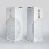
DESIGN NAME: Japanese Sake
PRIMARY FUNCTION: Packaging Design
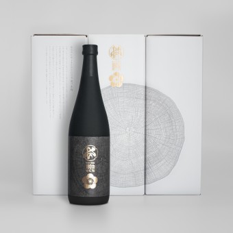
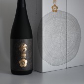
INSPIRATION: In order to express the traditional taste and skills that have been handed down for 180 years, we used the "tree ring" as the main visual to express the history and future.
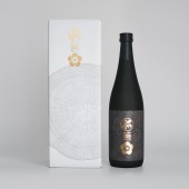
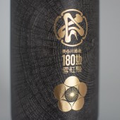
The overall color of the outer box was inspired by ink painting to express a sense of tradition and luxury. The commemorative logo was printed in gold to match the family crest of the brewery. The bottle inside is a contrasting black image. The roughness of the bottle expresses the weight of tradition and technology.
UNIQUE PROPERTIES / PROJECT DESCRIPTION: Hasegawa Sake Brewery has been in business for over 180 years in Nagaoka City, Niigata Prefecture. The company building is registered as a Japanese cultural heritage site. This product is a special sake made to commemorate the 180th anniversary of the company's founding.
OPERATION / FLOW / INTERACTION: This package is made of glass bottles and paper.
PROJECT DURATION AND LOCATION: 2022, project commissioned by Hasegawa Brewery Co.
FITS BEST INTO CATEGORY: Packaging Design
|
PRODUCTION / REALIZATION TECHNOLOGY: The difficult part of this project was the printing of the outer box. We visited several printing companies, but they were all far from ideal quality. Luckily, we were introduced to an experienced company that specializes in box printing, and we were able to solve this problem.
SPECIFICATIONS / TECHNICAL PROPERTIES: Height 322mm × Width 115mm × Depth 115mm
TAGS: sake,japanese sake,package,box
RESEARCH ABSTRACT: Although the product is well-known in the region and has tradition and history, consumers are tired of the same design, and it was necessary to express newness in addition to tradition and luxury. Furthermore, and most importantly, the brewery itself needed to be expressed in the design.
CHALLENGE: Because of the special design representing the brewery itself, it was essential to propose a concept that would be acceptable to the client. Therefore, we spent the most time on creating and proposing a concept for this project.
In the design, we focused on the layout as well as the printing in order to create a Japanese taste. The surface of the outer box is treated with a special scratch-resistant finish to give it a luxurious feel.
ADDED DATE: 2023-03-07 07:18:56
TEAM MEMBERS (1) : Printing: Takakuwa Art Printing Co.
IMAGE CREDITS: Shinji Yaoita, 2022.
|