DESIGN NAME:
Doritos Rainbow Limited Edition 2022
PRIMARY FUNCTION:
Food Packaging
INSPIRATION:
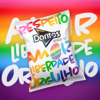
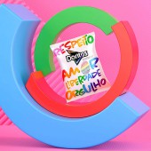
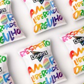
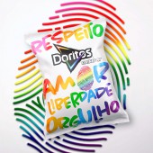
For the packaging, the design team stayed true to the Visual Identity of Doritos Rainbow with a clean white substrate, stylized rainbow, and colors of the LGBTQ+ flag. The team wanted the design to be bolder than ever to make a statement for the respect of diversity, so we included the strong words, “RESPECT, LOVE, FREEDOM, PRIDE” in a hand-drawn, freestyle typographic font.
UNIQUE PROPERTIES / PROJECT DESCRIPTION:
Doritos Rainbow has become an annual staple of celebrating Pride. Doritos Rainbow reaffirms the commitment against any type of discrimination and promotes respect for diversity. Standing in support of the rights of the LGBTQ+ community, the message of Doritos Rainbow also speaks against prejudice of any kind not only during the Pride Festival, but every day. The core value of Doritos Rainbow is “be bold no matter what.”
OPERATION / FLOW / INTERACTION:
-
PROJECT DURATION AND LOCATION:
-
FITS BEST INTO CATEGORY:
Social Design
|
PRODUCTION / REALIZATION TECHNOLOGY:
-
SPECIFICATIONS / TECHNICAL PROPERTIES:
-
TAGS:
-
RESEARCH ABSTRACT:
-
CHALLENGE:
-
ADDED DATE:
2023-02-27 19:28:09
TEAM MEMBERS (1) :
IMAGE CREDITS:
PepsiCo Design and Innovation, 2022.
|


