DESIGN NAME:
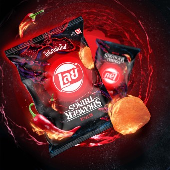
Lay's x Stranger Things
PRIMARY FUNCTION:
Food Packaging
INSPIRATION:
The Stranger Things fan base is a devoted one with a global following, and they will happily immerse themselves in all things ‘Upside Down.’ Knowing this, Lay’s collaborated with Netflix to create limited edition packaging that would create excitement and build awareness for the much-anticipated launch of season 4. The Design Team turned traditional packaging design principles on their head to deliver a buzz-worthy and collectible Lay’s x Stranger Things design to delight the show’s fans. This cleverly inverted Lay’s design was exclusively available for purchase at 7-Eleven retail locations in Thailand.
UNIQUE PROPERTIES / PROJECT DESCRIPTION:
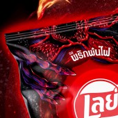
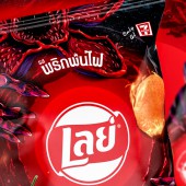
In a departure from the usual bright yellow the brand is known for; Lay’s x Stranger Things touts a dramatic black substrate with radiating red concentric circles emanating from the Lay’s logo. The infamous force of evil that is the Demorgon is depicted with jaws open and creepy claws appear to clutch the pack. Taking the show’s concept of ‘Upside Down’ quite literally, the Stranger Things logo appears upended at the bottom of the pack. Flavor cues are also present on pack as the team included a flaming chili pepper and Lay’s chip to indicate the Flamin’ Hot flavor.
OPERATION / FLOW / INTERACTION:
-
PROJECT DURATION AND LOCATION:
-
|
PRODUCTION / REALIZATION TECHNOLOGY:
-
SPECIFICATIONS / TECHNICAL PROPERTIES:
-
TAGS:
-
RESEARCH ABSTRACT:
-
CHALLENGE:
-
ADDED DATE:
2023-02-27 19:10:59
TEAM MEMBERS (1) :
IMAGE CREDITS:
PepsiCo Design and Innovation, 2022.
|


