DESIGN NAME:
Happiness
PRIMARY FUNCTION:
Residence
INSPIRATION:
The site is a new 138.8 square meter apartment in Taoyuan, the happy home of a doctor and a nurse. During the discussion, the design team felt that they respected each other's freedom and spiritual independence. The director of Uroomage, Jazmin Lin, therefore applied curves, minimalistic lines, and a variety of materials to create a spacious and grand residence. The restrained and elegant style allows the residents to become the protagonist in the space.
UNIQUE PROPERTIES / PROJECT DESCRIPTION:
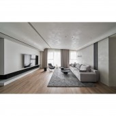
In the public area, the huge pillars are eliminated by simplifying the design and enlarging the entrance. The curved corners of the turning corridor create a sense of ritual of coming home. In addition, many storage rooms are added to meet the storage needs of a family of four. To encourage children to go out of their rooms and to increase interaction among family members, the client wanted a spacious living room. The design team combined the TV wall with the closet in the children's room, with a double-sided cabinet to eliminate the wall needed for a partition to achieve revitalized storage and functionality.
OPERATION / FLOW / INTERACTION:
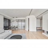
Despite the square layout of the site, the beams and columns are quite large, so the interior has a strong sense of oppression. To solve the structural disadvantage, the design team used curved trim on the walls of the storage room, and the lighting to lighten the space visually. The kitchen is divided into sections according to the open plan. The sliding glass door brings in light from the balcony and creates a bright glass box-like effect. While mom and dad cook, the kids play and watch TV in the living room, which is a cozy daily life for this family.
PROJECT DURATION AND LOCATION:
The project finished in August 2022 in Taiwan.
FITS BEST INTO CATEGORY:
Interior Space and Exhibition Design
|
PRODUCTION / REALIZATION TECHNOLOGY:
The space is based on white and gray, with a special coating of beige as the overlay to present the elegant style in the public area. The curved ceiling is covered by gray special paint and the wooden flooring is warm, creating a harmonious aesthetic. On the next side, the suspended TV wall enhances the transparency and injects a touch of warmth into the space. The dining and kitchen areas continue the same elements, incorporating natural stone, wood veneer, and ironwork to form a wonderful highlight on the facade.
SPECIFICATIONS / TECHNICAL PROPERTIES:
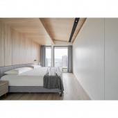
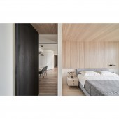
The site is a new apartment with a total area of 138.8 square meters, with 3 bedrooms, a living room, a dining room, and 3 bathrooms. The design team fully integrated the client's needs and transformed the site into a three-bedroom, two-room space. They installed a double-sided cabinet to combine the TV cabinet in the living room and a closet in the children's room to enlarge the living room and improve the utilization of the public area. In the private area, the design team used wood and white to create a relaxed and elegant bedroom. The L-shaped dressing rooms on the left and right sides are a wall when the door is closed.
TAGS:
Uroomage, minimalist style, special paint, TV cabinet, empty apartment.
RESEARCH ABSTRACT:
The project focuses on 'people' and took a minimalist style with various materials to showcase delicate textures and colors under the daylight. The minimalistic residence has a unique view and lighting due to its height. The interior features open and interconnected traffic flow. The entrance is paved with stone-patterned tiles and decorated with natural stone on the walls. At the same time, the design team removed unnecessary walls to create a more spacious scale that embodies minimalism and grandeur. The curves, simple lines, and diverse material combinations enrich the look.
CHALLENGE:
The open plan of the public area is defined only by curved surfaces and light. The foyer, living room, dining room, and storage room are connected to create better spatial continuity and visual amplification, while the circulation is guided by materials and design techniques. At the same time, the design team set up storage in the same area to avoid the compression of space by scattered cabinets. In the private area, the bedroom is in a restrained design. The design team wrapped the beams with a sloped ceiling and embedded light boxes in the ceiling instead of chandeliers or track lights.
ADDED DATE:
2023-02-25 12:14:13
TEAM MEMBERS (1) :
Jazmin Lin, Max Zhou, Azure Lin
IMAGE CREDITS:
SHISHAN
|
