DESIGN NAME:
The Ho
PRIMARY FUNCTION:
Hotel
INSPIRATION:
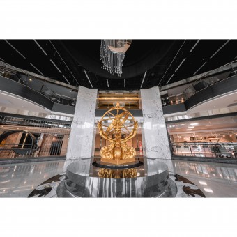
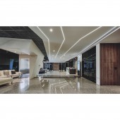
The linear ceiling and the staggered design on the walls intertwine a circular base of the lobby. The lobby is like a globe, wrapped in horizontal and vertical lines. The longitudinal and latitudinal imagery represents the optimization of international and commercialized space. The hotel welcomes every visitor from all over the world with a new look.
UNIQUE PROPERTIES / PROJECT DESCRIPTION:
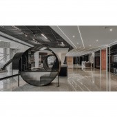
Even though it is a renovation project, they still put people as the core consideration, which is also the aesthetic pursuit of the project. The theme is gray. The various layers of gray in the lobby stairs, flooring, corridors, and furnishings are all impressive. At the same time, the design team retains the natural lighting advantage of the site, so that the tone of the space can reach the perfect balance. Different from ordinary hotels, the project is targeted at businesspeople, providing more working space for individual meetings or group consultations.
OPERATION / FLOW / INTERACTION:
Formal or casual, the project has a neutral and modern concept. The design team re-examined the location to create a space that meets the needs of the customers. The lobby on the first floor includes office space for individuals, a multi-person forum, and a sofa lounge. With its high ceiling, the design team introduced bright natural lighting and installed adjustable LED lights at the seats to provide a comfortable experience for customers to relax and work.
PROJECT DURATION AND LOCATION:
The project finished in February 2022 in Taiwan.
FITS BEST INTO CATEGORY:
Interior Space and Exhibition Design
|
PRODUCTION / REALIZATION TECHNOLOGY:
Marble, linear lighting, ceiling molding design, light steel frame trims, achromatic color (black, white, and gray), laminate hard plastic sheet, black mirror, artificial stone. The renovation reveals a new style through the renewal of building materials. The design team reversed the look of the original space, redefining the old hotel and creating a more functional and aesthetic experience.
SPECIFICATIONS / TECHNICAL PROPERTIES:
The site is a 630 square meter, one-story, nearly ten-year-old hotel lobby. After the second generation takes it over, the hotel becomes a more contemporary, functional, and efficient space this renovation. In the original high-ceilinged space, the design team first added the most characteristic dome with long, staggered linear tassels, echoing the installation art below as the highlight. The gray theme emphasizes the space's elegance, and the grayscale tone changes show a multi-faceted and calm atmosphere.
TAGS:
Dome, Hotel, Business space, Bright lighting, Aesthetic experience.
RESEARCH ABSTRACT:
The project is a renovation of a hotel taken over by the second generation. The theme of the interior is gray, supplemented by curved shapes to reverse the impression of the old space. Secondly, the efficiency function for businesspeople is taken into consideration. The design team planned several working areas, including individual work areas and group meeting areas. Mirrors, linear lighting, and grayscale highlight the modern atmosphere. While successfully reversing the brand image, the hotel has also become the first choice for local businesspeople and international travelers to work and relax.
CHALLENGE:
This project is a renovation. Since the commercial orientation of the site is different from the previous one, the design team optimized the functionality and created a professional design that is more conducive to the local customers, replacing the previous slightly baroque and fancy style with a functional look. The renovation process required more time to confirm the fire protection settings. The design team had to recheck all the fire safety regulations, update and adjust them, and last but not least, the aesthetics.
ADDED DATE:
2023-02-25 11:43:42
TEAM MEMBERS (1) :
IMAGE CREDITS:
HYH Architects
|


