DESIGN NAME:
Footsync
PRIMARY FUNCTION:
Multifunctional App
INSPIRATION:
Footlight's objective was to deliver a proposal for a project in an unused plot in Fuenlabrada. The results of the research inspired and justified every aspect of this project, resulting in the implementation of interactive lights as the core element, and cognitive games and use of a giant-interface pump track as some of the mediums to achieve the desired results. What inspired FootSync was translating that essence and experience of Footlight into a portable system, making it more accessible.
UNIQUE PROPERTIES / PROJECT DESCRIPTION:
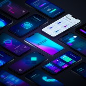
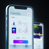
FootSync is part of a bigger project called Footlight Square. This project implements the use of interactive lights to offer, among others, cognitive games to prevent the appearance of neurological diseases. FootSync responds to the need of being able to benefit from what Footlight has to offer when being away; providing access to the cognitive games and brain-capacities tests, keeping track of your progress, synchronizing your stats, registering on activities, etc.
OPERATION / FLOW / INTERACTION:
When accessing the App, the user gets to the main menu formed by different screens related to the main aspects of the project. By swiping left or right the user can navigate through these options and by swiping up or down enter or get out from them. FootSync implements a near "Buttonless" design that reduces the use of buttons, relying on gestures for the majority of scenarios, making the paths to the desired destinies within the UI easier to remember.
PROJECT DURATION AND LOCATION:
The project started in September 2020 in Madrid and finished in May 2021 in Madrid. It was presented and revisited in 2021 and 2022 on different occasions and was well received.
FITS BEST INTO CATEGORY:
Interface, Interaction and User Experience Design
|
PRODUCTION / REALIZATION TECHNOLOGY:
The design process used programmes such as Sketch, Photoshop or After Effects. The methodology adopted began with conceptualizing and making a necessities analysis, followed by organising the UI around the results, with diagrams and navigation trees created under the standards described in The Elements of User Experience by Jesse James Garret. Then the wireframing, which resulted in a better element disposal, and ended by making the visual decisions that best fit the project's objectives.
SPECIFICATIONS / TECHNICAL PROPERTIES:
The design is responsive, adapting to fit every device and screen.
TAGS:
interactive lights, interface, Lightmorphism, footlight, neon lights, cognitive games, neurological, app
RESEARCH ABSTRACT:
The initial stage consisted of an external analysis to understand the context surrounding the project, using a PESTLE Analysis, interviewing neighbours and people within the target spectrum of the project and seeing analytics from the AppStore or Google Play. For the internal aspects of the project, tools such as a SWOT Analysis, VRIO Analysis or the McKinsey 7S Model were used. To connect everything, conceptual and systemic maps, flowcharts, user-persona and many other tools were the go-to.
CHALLENGE:
The most challenging part of this project was transferring the appeal and feeling of using real interactive lights, into an App/ website, in a way that captures the essence and beauty of the interaction, but avoids producing an overwhelming and exhausting experience. That led to extreme caution when selecting the visual elements and the way they would be used in the interface, resulting in an eye-catching appearance which turned out to be one of the most characteristic things of the project.
ADDED DATE:
2023-02-24 16:18:29
TEAM MEMBERS (1) :
Carlos Jimenez Garcia
IMAGE CREDITS:
Image #1: Designer Carlos Jimenez Garcia, FootSync, 2020
Image #2: Designer Carlos Jimenez Garcia, FootSync, 2020
Image #3: Designer Carlos Jimenez Garcia, FootSync, 2020
Image #4: Designer Carlos Jimenez Garcia, FootSync, 2020
Video Credits: Carlos Jimenez Garcia, Footlight Square, 2021
|


