DESIGN NAME:
For Two
PRIMARY FUNCTION:
Residence
INSPIRATION:
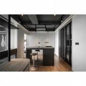
The entire space is bright and open, with a '360-degree view of the entire space from anywhere' at the core. The planning is extended by the dressing room and the kitchen island as centers. The whole space is divided into two concentric circles with these two places as the center, and the structure is circular. Moreover, the track lights installed under the beams reduce the sense of pressure in the space and also in a circular structure, and three concentric circles can be seen from the top down.
UNIQUE PROPERTIES / PROJECT DESCRIPTION:
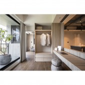
Glass facilitates lighting and brings brightness to the space. The design team takes the characteristics of the material to draw light into the interior, creating a distinct romance between day and night. Outside the window is lush greenery. The design team takes the 'borrowed view' technique, using glass to frame the view outside the window, just like a large picture frame. The design team sets the dressing room and the kitchen island as the centers, drawing two concentric circles to create a circular route. The track lighting installed in the ceiling also echoes the layout.
OPERATION / FLOW / INTERACTION:
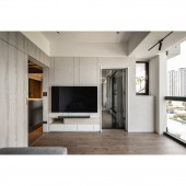
Instead of the traditional plan of a living room, the project takes two concentric circles through the space to form a circular route. The dressing room and the kitchen island serve as the centers, allowing people to look around the space from every angle. In this way, clients can use the space as they wish. The team takes the 'borrowed view' technique to frame the greenery outside the windows, bringing in the beauty through large transparent glass partitions and floor-to-ceiling glass windows.
PROJECT DURATION AND LOCATION:
The project finished in Taiwan.
FITS BEST INTO CATEGORY:
Interior Space and Exhibition Design
|
PRODUCTION / REALIZATION TECHNOLOGY:
The glass is conducive to lighting and draws light into the interior, while the vertical transparent items retain a sense of penetration for storage. Some cabinets are made of iron and glass to create a diverse visual layer. Meanwhile, the stainless-steel kitchen island is the highlight. and the glass of the dressing room guides the light and shadow of the whole space. The design team installs light strips to make the dressing room look lighter. At the same time, the glass and partitions allow the structure to replace the cabinetry, embodying the concept of 'penetration�39;.
SPECIFICATIONS / TECHNICAL PROPERTIES:
The project is for two people. The linear lighting on the beams forms light and shadow changes, and the glass windows draw light into the room for a more open view. Besides, the doors of each space are sliding doors for intimacy and privacy. Not to block the view with the cabinets, the design team make the cabinets 'formless' to lighten the storage. They replace parts of the wall structure with transparent vertical partitions that might block light penetration.
TAGS:
Light, penetration, greenery, dual-axis structure, open plan.
RESEARCH ABSTRACT:
The project removes the traditional concept of the living room and enclosed partition and instead takes a bold and innovative double-axis concentric circle through the space. The project takes the dressing room and the kitchen island as the cores, including the kitchen, the audio-visual room, the study room, and the master bedroom, all of which extend around the two centers. This layout allows for unobstructed routes between the different areas, they can choose the space they want to go to according to their needs while maintaining intimacy and privacy.
CHALLENGE:
The project has been planned since the pre-sale stage. However, the space is completely deconstructed, and the beams are not in the expected position. Therefore, the design team set up a circular track light under the original beam and raise the height with color flashing to weaken the volume. In this way, in addition to reducing the visual load, the sense of oppression is also eliminated, and it can echo the circular layout. Additionally, there were no water pipes for the kitchen island. The design team replans the pipes so that the water is supplied smoothly.
ADDED DATE:
2023-02-24 08:45:19
TEAM MEMBERS (1) :
IMAGE CREDITS:
Liumu Design
|


