DESIGN NAME:
Cozy Life
PRIMARY FUNCTION:
Shared Space
INSPIRATION:
The client is fascinated by the old house and expects a multi-functional shared space in the center of the city where artists could gather in a quiet and comfortable environment to express their creativity. At the same time, the client wants to preserve the traces of the old house. To achieve these requirements, the designer uses recycled wood, glass, and tiles to create a nostalgic atmosphere without altering the original structure while creating separate work areas yet linking people together.
UNIQUE PROPERTIES / PROJECT DESCRIPTION:
The three-story house is more than 40 years old and it is a common narrow streetside building in early Taiwan. The long layout is both a strength and a drawback. Because it has sufficient depth, it can be planned into different areas to meet the needs of the client. However, the long and narrow space also causes a lack of natural light, resulting in a dark interior. To deal with these disadvantages, the designer reshapes the space by changing the routes, removing partitions, creating a patio, and enhancing lighting to form a brighter look and improve functionality
OPERATION / FLOW / INTERACTION:
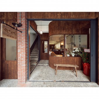
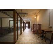
To eliminate the oppressive feeling of the long and narrow layout, the designer removes the wooden partitions to create a spacious and open space and then uses wood and glass to create a nostalgic and independent work area. In addition, the designer cuts out holes in the floors and inserts large pieces of glass to bring in natural light from the patio on the top floor, then installs different lighting fixtures to create a charming atmosphere with a retro and post-modern style. The red brick walls, stone flooring, and newly applied red and white tiles perfectly reflect the unique traces of the old house.
PROJECT DURATION AND LOCATION:
The project finished in May 2021 in Taiwan.
FITS BEST INTO CATEGORY:
Interior Space and Exhibition Design
|
PRODUCTION / REALIZATION TECHNOLOGY:
The client expects the designer to fully express the characteristics of the old house. Therefore, the designer uses recycled wood instead of metal components to control the budget and echo the atmosphere of the space, thus creating an image of the nostalgic era. Equally important, the glass and tiles play an important role in the space. They reinforce the vintage style that the client desires and remove visual barriers from the shared areas above the second floor, making it for more people to be in the space together at the same time.
SPECIFICATIONS / TECHNICAL PROPERTIES:
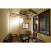
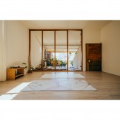
The project has four floors with a total area of 396.6 square meters, with a single floor area of approximately 99.1 square meters. The first floor is a cafe and seating area, the second floor is a photography studio and private rooms, the third floor is a separate work area and private rooms, and the top floor is a yoga studio which can also be used as an exhibition hall or lecture venue and a terrace. The designer plans different functions for each floor so that the artists and freelancers can exchange their network and creativity.
TAGS:
Old house, shared space, vintage, nostalgia, light and shadow effects.
RESEARCH ABSTRACT:
Although the client likes the old house, he also understands there are many layout flaws in the long and narrow street-side building. The designer's core idea is to create smooth routes within a limited budget, to meet the needs of freelancers, to create an aesthetic in harmony with the history of the house, to reverse the dark impression of the interior, and to renovate it into a bright, experimental, and interesting space. The designer uses pure materials, including recycled wood, glass, and tiles, with a variety of light sources to create a subtle, timeless, and charming look.
CHALLENGE:
With a limited budget, the challenge for the project is to adjust the interior layout of the traditional narrow streetside building to bring in natural light while setting up themes for the second, third, and top floors to maximize every inch of space. Moreover, transforming a residential building into a commercial space requires an eye-catching plan. The designer creates an old-fashioned bar on the first floor and replaces the windows on the facade and the doorway to the second floor, adding brick walls, signs, and other items to form a distinctive style to attract customers.
ADDED DATE:
2023-02-24 06:54:12
TEAM MEMBERS (1) :
Fei-Lung Huang
IMAGE CREDITS:
JR.Studio
|


