DESIGN NAME:
The View
PRIMARY FUNCTION:
Residence
INSPIRATION:
The project serves a family of four and the elderly. In a space with a wide age range of occupants, the habits and needs of each family member must be considered. Therefore, hotel-style is the core of the project. At the same time, the design team makes good use of the advantages of the space, such as the garden view outside the window. They invoke daylight and natural elements into the interior through large floor-to-ceiling windows and use the technique of convergence to eliminate the shortcomings of the environment to form a refined modern-style residence.
UNIQUE PROPERTIES / PROJECT DESCRIPTION:
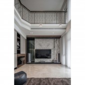
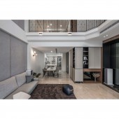
The TV Wall: It is the main visual wall as the core of the space. The design team takes marble as the main body with precision-cut gray mirrors, each 1cm apart, which has a calm and magnificent atmosphere and perfectly complements the marble. It is worth mentioning that the design team uses smooth material to create an uneven visual effect. Improve the spaciousness: To make the long and narrow space more open and brighter, the design team applies two techniques. The first is to place all the cabinets on the facade and align them with the walls.
OPERATION / FLOW / INTERACTION:
The project is a renovation of an old house, and the design team makes many plans to fit the living habits of the client family. For example, the living room is planned on the second floor with good lighting, which not only makes the view more spacious and brighter but also makes the living room function more completely. Moreover, the air-conditioning unit on the second floor is made into a comfortable tatami room, so that the family can appreciate the starry sky outside the window and enjoy life.
PROJECT DURATION AND LOCATION:
The project finished in June 2022 in Taiwan.
FITS BEST INTO CATEGORY:
Interior Space and Exhibition Design
|
PRODUCTION / REALIZATION TECHNOLOGY:
Building materials: marble, gray mirror, wood grain tile, melamine, iron parts, glass, leather, eco-friendly latex paint, trims, engineered wood, etc. Each area has its corresponding materials. The public area is shaped with materials with a gorgeous texture, such as stone, iron parts, and gray mirrors. The private area also continues the tone of the public area, but with warm materials such as leather, wooden trims, and wood grain tiles to present an elegant atmosphere.
SPECIFICATIONS / TECHNICAL PROPERTIES:
The project is a 6-story pre-owned house with a total area of 231.4 square meters, with 4 plus 1 rooms, a living room, and a dining room. In terms of layout, rather than set the first floor as the public area in Taiwan, the first floor of the project is the entrance and garage, while the second floor is the core space for the family's daily use. For this, the design team removes e living room ceiling on the second floor to form a duplex design and to increase lighting and spaciousness. Lastly, above the third floor are the private areas of the master bedroom, study room, and second bedroom.
TAGS:
Duplex, light tone, large area, open plan, hotel style design.
RESEARCH ABSTRACT:
The open layout allows natural light to fall evenly on every part of the space, maximizing the lighting advantage. The theme of the space is a light tone with modern design aesthetics, supplemented by lines to build a refined residence with humanistic. The pink tile flooring in the public area echoes the warm wooden flooring in the private area, and the two complement each other in the bright space to achieve a tensioned expression of enlarged vision and layout.
CHALLENGE:
The site had many large and small beams, which led to a chaotic visual effect on the wall. The design team utilizes the irregular spaces to combine with the storage and finishing of the facade lines to shape a square and comfortable layout while increasing the storage space to achieve both design and functionality.
ADDED DATE:
2023-02-24 05:30:39
TEAM MEMBERS (1) :
IMAGE CREDITS:
Upward Information Design
|


