DESIGN NAME:
Balance
PRIMARY FUNCTION:
Residence
INSPIRATION:
The client is family-oriented and considers the living room is the most important space for a family of three. The design team transforms the three-bedroom layout into two bedrooms to expand the living room, dining room, kitchen, and other public areas so that the client's family can have a comfortable environment and friends can have enough space to move around when they visit. Besides, the project is an understated luxury style, showing a non-extravagant but textured look.
UNIQUE PROPERTIES / PROJECT DESCRIPTION:
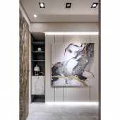
TV wall: To meet the clients requirements, the TV wall is made of marble to present a grand sense, while the cabinets on both sides are in an irregular shape to present a lively look. The doors of the cabinets are roller blinds, making the cabinets look like speakers and providing storage and heat dissipation for appliances. The wall behind the sofa, Opposite the TV wall: the wall behind the sofa provides a display function on the one hand and conceals the doors of the master bedroom, the second bedroom, and the rear balcony on the other. The combination of bedroom doors and cabinet doors is aesthetic and private.
OPERATION / FLOW / INTERACTION:
The family likes to stay in a comfortable public area. For example, the son is willing to stay in the living room or dining room to do his homework when he comes home, and the semi-open design of the kitchen sliding door allows the wife to interact with other family members while cooking, so all the members can enjoy a warm and cozy time in the public area. Besides, the enlarged living room can accommodate more visitors, making the space full of a lively atmosphere. The client believes that this is the kind of life he wants and that the design of the space brings people joy.
PROJECT DURATION AND LOCATION:
The project finished in August 2018 in Taiwan.
FITS BEST INTO CATEGORY:
Interior Space and Exhibition Design
|
PRODUCTION / REALIZATION TECHNOLOGY:
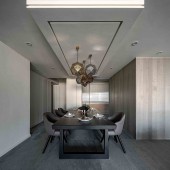
Building materials: roller blinds, laminate flooring, iron parts, glass, marble, glass, moru glass, system cabinets, floor tiles, thick tiles, wood veneer, artificial leather, etc. The dining table is made of two centimeters thick tiles, considering the needs of the clients family. Unlike ordinary stone, thick tiles have almost no pores and therefore have a low water absorption rate. Even after a long time, the surface still looks new and easy to clean.
SPECIFICATIONS / TECHNICAL PROPERTIES:
The total area is 102.4 square meters, with three bedrooms, a living room, and a dining room. After the renovation, there is a foyer, living room, dining room, kitchen, master bedroom, and second bedroom. The original layout was three bedrooms, a living room, and a dining room. The design team considers the client's needs and decided that in the high-priced Taipei area, there is no need to reserve extra space but to enlarge the most frequently used areas. The design team removes the seldom-used room partitions and expands the living room, kitchen, and other public areas so that the family can enjoy a more comfortable space.
TAGS:
Family, texture, symmetry, life, understated luxury.
RESEARCH ABSTRACT:
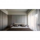
The design team translates the client's idea of valuing interpersonal relationships into the public area, providing a spacious space for the client's family by expanding its size. Whether people are spending time together or working on their own, each one can find their corner. The wall behind the sofa opposite the TV wall has three functions: storage, display, and concealed doors. The client often invites his friends to his home. For privacy and aesthetics, the master bedroom door, the second bedroom door, and the balcony door are hidden in the wall.
CHALLENGE:
Since the client does not want the bedroom door to be visible to the visitor, the design team conducts to great lengths to make the wall behind the sofa function as a storage, display, and concealment of the bedroom door. In addition to measuring the scale, the construction is time-consuming. In the end, the design team combines different materials and appropriate block divisions to create a visual effect that perfectly integrates the bedroom door and the cabinet door. In this way, the public area does not appear to be divided by the bedroom door, and consistency is achieved
ADDED DATE:
2023-02-24 01:58:13
TEAM MEMBERS (1) :
-
IMAGE CREDITS:
SanGong Design
|


