Gaenyeomsuda Textbook by Miraen Design Team |
Home > Winners > #148329 |
 |
|
||||
| DESIGN DETAILS | |||||
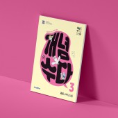
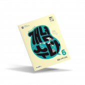
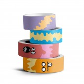
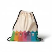
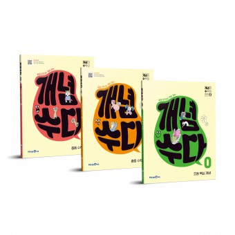
| DESIGN NAME: Gaenyeomsuda PRIMARY FUNCTION: Textbook INSPIRATION: Inspiration was sought after the teens’ culture who are the main targets of the book. They enjoy communicating with their own language in their own world. Prime examples would be customizing and abbreviation. One’s own diary is written without any templates but rather done with the flow of his/her own thoughts with the collection of the things he/she likes. -Customizing. Communicate in their own language. - Abbreviation. Speech balloon was selected as the motif inspired by the above. UNIQUE PROPERTIES / PROJECT DESCRIPTION: GAENYEOMSUDA was made with the purpose to provide easy access to the students. The brand name GAENYEOMSUDA is an abbreviation that comes from the sentence 'concept is everything in math' and it contains its identity as well. Abbreviation and customizing, which represent the teen’s culture, were reflected in the logo to intuitively express the brand concept which is to show that tough math concepts can be studied with joy just like having a chat with a friend. OPERATION / FLOW / INTERACTION: Various applications utilizing the brand such as daily appliances, stationaries, etc. are introduced to create friendly vibe around math as it is used naturally on a daily basis. As the brand becomes more familiarized, math won’t be hated so much at least. PROJECT DURATION AND LOCATION: The project was from August 2022 to November 2022 and it went on sale from December 2022 |
PRODUCTION / REALIZATION TECHNOLOGY: The brand concept, which is to encourage studying math with joy as if chatting with a friend, was expressed in the form of a speech balloon. The hand-drawn looking logo design and the illustration interest the students. People who have experience scribbling on the cover of textbooks being tired of studying must know what this is showing. Happy memories will make it easier to start studying SPECIFICATIONS / TECHNICAL PROPERTIES: 210mm x 260mm The whole page was matte laminated and the logo and the pictures were coated with epoxy TAGS: Textbook,Education,P RESEARCH ABSTRACT: Math is hard and boring to most of the students and there is even an expression that says SUPOJA which means ‘people who have given up on math’. However, there is an easy way to start studying math. This project was started with the purpose of making students open the book without feeling uneasiness towards math like the famous Aristotle’s saying ‘well begun is half done’. This will help students who might have been afraid of math start studying math CHALLENGE: Studying is difficult to most people including math. Various ways to solve this problem are being researched but no solution’s been found to be satisfying. Many ways were thought of to provide easier start to studying and using foil printing (black foil) was one of the things that could interest the users. However, there was a risk of error when massively produced, therefore, transparent epoxy was used for both the logo and the pictures to solve the problem ADDED DATE: 2023-02-13 09:36:24 TEAM MEMBERS (4) : MiraeN design team, Creative Director Hyunji Son, Brand Design Kiwook Kim, Wookhoon Kwon and Media Design Seyoung Hong IMAGE CREDITS: Miraen Design Team, 2022. |
||||
| Visit the following page to learn more: http://www.mirae-n.com | |||||
| AWARD DETAILS | |
 |
Gaenyeomsuda Textbook by Miraen Design Team is Winner in Education, Teaching Aid and Training Content Design Category, 2022 - 2023.· Read the interview with designer Miraen Design Team for design Gaenyeomsuda here.· Press Members: Login or Register to request an exclusive interview with Miraen Design Team. · Click here to register inorder to view the profile and other works by Miraen Design Team. |
| SOCIAL |
| + Add to Likes / Favorites | Send to My Email | Comment | Testimonials | View Press-Release | Press Kit |
Did you like Miraen Design Team's Education Design?
You will most likely enjoy other award winning education design as well.
Click here to view more Award Winning Education Design.


