Modern Courtyard Residential by Tai Kuan Huang |
Home > Winners > #148321 |
 |
|
||||
| DESIGN DETAILS | |||||
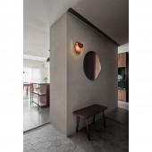
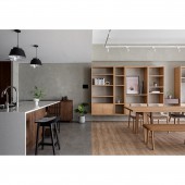
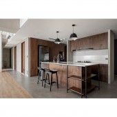
| DESIGN NAME: Modern Courtyard PRIMARY FUNCTION: Residential INSPIRATION: The design of public area integrated with concept of three entry courtyard of Chinese traditional buildings, which satisfied the daily life needs of the building through the interior space, bringing in the sense of space dimension and ritual of home. UNIQUE PROPERTIES / PROJECT DESCRIPTION: The planning of 1423 sqft space started with change of intended house layout. Four areas of spacious living room and dining room, 2 circular flows with the entryway opening to the kitchen, master bedroom and 2 guest bedrooms were divided based on everyday living requisites, with the corridor as axis, height of ceiling and terrace boundary. OPERATION / FLOW / INTERACTION: The house owners valued rituals of life and interactions with kids, loving the lightness and refreshment brought by Zen. Therefore, we designed and customized the cabinets, laminates and furniture in the public area by ourselves. There was no traditional standard ceiling in the spacious living room and dining room. With height difference created by the ceilings, space here is more spacious and enlarged, while also allowing light to shine through. The design broke the impression of a standard living room and left plenty of empty space for flexible future living needs. PROJECT DURATION AND LOCATION: The project started in March 2022 and finished in June 2022 in HsinChu Taiwan FITS BEST INTO CATEGORY: Interior Space and Exhibition Design |
PRODUCTION / REALIZATION TECHNOLOGY: Area from front door to the entryway was called "first entry", which was also the first circular flow moving line based on daily living needs. Entering the kitchen from entryway, you would see the huge cooking area. This was what we called "second entry" and the second circular flow. The "third entry" could be found in the living room and dining room. SPECIFICATIONS / TECHNICAL PROPERTIES: 1423 square feet TAGS: home, residential, interior, Taiwan, interior design RESEARCH ABSTRACT: The original in-line kitchen planned by the builder was changed into open storeroom subject to client's change of layout, which, in addition to sparing enough room for storage but also for spacious kitchen and kitchen island. Another key change was the direction shift of the master bathroom door, which brought the square bedroom and satisfactory dressing room. CHALLENGE: In response to the client's desire for light and refreshing aesthetics, only two types of wood were used in the space: white oak and walnut, which, in addition to creating the proportion of visual lightness and heaviness as well as space dividing, it could also present the purity of the space and warmth of nature credited to the natural clouds on the wall produced by the designer's special proportioned mortar. ADDED DATE: 2023-02-13 08:00:17 TEAM MEMBERS (1) : IMAGE CREDITS: Image #1: Photographer Jackal Liu Image #2: Photographer Jackal Liu Image #3: Photographer Jackal Liu Image #4: Photographer Jackal Liu Image #5: Photographer Jackal Liu |
||||
| Visit the following page to learn more: http://www.facebook.com/ktdesigntw | |||||
| CLIENT/STUDIO/BRAND DETAILS | |
 |
NAME: KT Design Studio PROFILE: Regaled client's heart with the appropriate Design. Let design bring a comfortable and good life. |
| AWARD DETAILS | |
 |
Modern Courtyard Residential by Tai Kuan Huang is Winner in Interior Space and Exhibition Design Category, 2022 - 2023.· Press Members: Login or Register to request an exclusive interview with Tai Kuan Huang. · Click here to register inorder to view the profile and other works by Tai Kuan Huang. |
| SOCIAL |
| + Add to Likes / Favorites | Send to My Email | Comment | Testimonials | View Press-Release | Press Kit |


