DESIGN NAME:
Zijin Art Museum
PRIMARY FUNCTION:
Interior Design
INSPIRATION:
We try to think about the essence of architecture directed at problem solving, and expect to unleash the most brilliant charm of the city in space. Visitor would be attracted by art and gradually become a part of the space, rather than as a distant onlooker.
UNIQUE PROPERTIES / PROJECT DESCRIPTION:
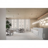
This design themed in “Order · Art” infuses the design concept of “Unbounded Design”, highlights the quiet and calm exterior in the form of interspersing, stacking, turning, priority level, order and other modern architecture design techniques, and creates a spatial aesthetic art gallery with modern, narrative, guiding and local poetic features.
OPERATION / FLOW / INTERACTION:
With the design logic and the moving line direction clarified, the entrance space is designed with vertical staircase that makes two floors associated. The first floor comes with the function of reception and sample room, while the water bar, negotiation and sand table and other crowded areas are disposed on the well-lit second floor, both are connected by annular moving lines, and the visual capacity is broadened in the limited area. All features available on the second floor are independent but associated, the flowing plan layout integrates sight, light, shadow, breath, rhythm and atmosphere, which in turn shapes a poetic and "homogeneous" ordered aesthetic of the space.
PROJECT DURATION AND LOCATION:
This project started the design stage in 2021 and was put into operation and open to the public in 2022.
FITS BEST INTO CATEGORY:
Interior Space and Exhibition Design
|
PRODUCTION / REALIZATION TECHNOLOGY:
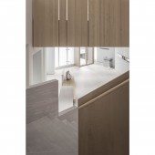
The project is made of wood veneer, stone, special paint and metal and makes a breakthrough in regrouping and combining different materials.
SPECIFICATIONS / TECHNICAL PROPERTIES:
The building covers an area of 1,200m2 and is composed of two floors, the first floor is front hall, reception desk, model room and craft show, and the second floor is brand video display area, sand table area, water bar area and negotiation area.
TAGS:
Art Gallery, Modern, Sample Rooms, Sales Center, Aesthetics, Architecture, Interior Design
RESEARCH ABSTRACT:
As part of the execution strategy of Zijin Art Gallery, the focus on details and daily use of functions is a sort of design attitude that caters to the vested needs and rational persistence. For space experimentation, we make a trade-off between people, architecture and the site area, and exploit appropriate aesthetic ideas to express and cross the venue limits, until the aesthetic characteristics suited to local conditions are shaped.
CHALLENGE:
In the prior-stage design consideration, how to plan a reasonable layout of three sample rooms and arrange the basic functions in line with the marketing needs on only 1,200 m2 construction site; the slope terrain limits cause poor lighting condition on the first floor, and the landscape on the interface of the building and parking lot is weakly functioning; in addition, the staggered form of building blocks results in cramped interior depth, which is believed to make the design work even more difficult. With the design logic and the moving line direction clarified, the first floor comes with the function of reception and sample room, while the water bar, negotiation and sand table and other crowded areas are disposed on the well-lit second floor, both are connected by annular moving lines, and the visual capacity is broadened in the limited area.
ADDED DATE:
2023-02-07 08:11:41
TEAM MEMBERS (1) :
Xie Fang, Hu Anqi, Zhu Wenjun, Xia Jinbo, Pan Zaojin, Zhang Lingjie
IMAGE CREDITS:
The Design Code Co.,Ltd, 2022.
|


