DESIGN NAME: When Black Meets White
PRIMARY FUNCTION: Residence
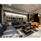
INSPIRATION: Walking into the open shared living space, one will notice that the designer has integrated the living room, dining room, and kitchen areas. By not setting up partitions, the designer not only increases the functional interior space but also allows the whole family to interact and bond. On the other side, the designer set black and white as the main color scheme for the living room, with bright orange leather chairs as the finishing touch to enliven the space.
UNIQUE PROPERTIES / PROJECT DESCRIPTION: This is an interior design project for a residential house. The designer has set black and white as the primary color scheme. Besides, the delicate lines and metal elements outline the contemporary light luxury of the spatial texture. Considering the homeowner's preference for collecting action figures, the designer has thoughtfully planned a storage cabinet and placed it in the space.
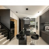
OPERATION / FLOW / INTERACTION: Also, the back wall of the sofa is different from the regular wall design, but with a whole glass display cabinet is to store the homeowner toys and brings a sense of visual extension. Furthermore, the dining area and the kitchen space continue the black and white color scheme, with a double ring linear chandelier above the dining table, revealing a modern and luxurious texture.
PROJECT DURATION AND LOCATION: The project was completed in July 2022 in Taiwan.
FITS BEST INTO CATEGORY: Interior Space and Exhibition Design
|
PRODUCTION / REALIZATION TECHNOLOGY: For the configuration of shared and private living areas, the designers have executed the layout smoothly, and the space is cleverly proportioned. The residence has turned into a warm and enjoyable living space.
SPECIFICATIONS / TECHNICAL PROPERTIES: This project is about 195 square meters
TAGS: Interior, Design, Residence, Modern, Style
RESEARCH ABSTRACT: A kitchen island is planned to improve the efficiency of the limited space, which could function as a dining table and a counter for food preparation. The private living space is on the second floor. In the master bedroom is a continuation of the black and white tones and is complemented by wood tones to bring a sense of warmth and spatial expression, providing a comfortable corner for the residents.
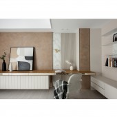
CHALLENGE: Besides, the dressing room is designed with gray glass to allow natural light to penetrate indoors, and it eliminates the oppressiveness of the walls. Moving to the secondary bedroom, one will realize that an earthy color scheme is planned to create a distinctly different and elegant atmosphere.
ADDED DATE: 2023-01-31 05:35:36
TEAM MEMBERS (1) :
IMAGE CREDITS: Chiang Ming Chan, 2022
|