DESIGN NAME:
Yue
PRIMARY FUNCTION:
Restaurant
INSPIRATION:
Wabi-sabi expresses gratitude for the beauty of modesty and rustic simplicity. Inspired by wabi-sabi aesthetic, the human-centered place, without extravagance and over-ornamentation, embraces the true essence of interior design. The hand-applied materials reflect the rustic and primitive texture. Intertwined with wood and metal, they create a delicate balance of tension between modern style and Japanese charm, and together build a quiet and unhurried dining scene.
UNIQUE PROPERTIES / PROJECT DESCRIPTION:
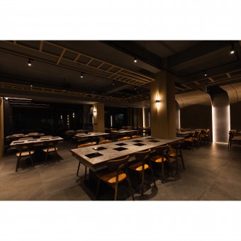
The Japanese aesthetic of wabi-sabi is injected into the space. With dark-colored interiors, mellow wooden gratings, and large curved surfaces, the place exudes a calm and stable atmosphere under the yellow glow. The large open floor-to-ceiling windows allow plenty of natural light into the space. In the interior, the partition walls are removed to offer unrestricted sight lines and allow the mind and body to unwind and decompress.
OPERATION / FLOW / INTERACTION:
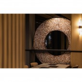
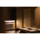
The space is divided into a reception counter, a seating area, and private rooms. The reception counter is made of hairline stainless steel panel that shimmers luxuriously and plays sparklingly with light and shadow, giving everyone a stylish yet warm welcome. In the seating area, the spacious space between seats is wide enough to allow people to move through, making it feel less crowded and confined. At one end of the structural pillar is a hollowed-out circular screen. The 3D mosaic tiles on the surface emit a lustrous glow to add extra softness to the silent space, while the full circle symbolizes wholeness and happiness
PROJECT DURATION AND LOCATION:
The project finished in January 2022 in Hsinchu City, Taiwan.
FITS BEST INTO CATEGORY:
Interior Space and Exhibition Design
|
PRODUCTION / REALIZATION TECHNOLOGY:
Suzuka cement texture, high definition printing board, atural weathered veneer, Italian slate tile, aluminum alloy tile, bamboo charcoal metal plate
SPECIFICATIONS / TECHNICAL PROPERTIES:
In the space of 232 square meters, there are a reception counter, a seating area, and private rooms.
TAGS:
Interior Design, Wabi-sabi, Japanese aesthetic, Human-centered, Dark-colored
RESEARCH ABSTRACT:
In terms of the design of the entrance, warm LED lights from the canopy emit a warmer, softer glow. The marble patterns on the wall create an inviting atmosphere. Pairing with neat coal-black lines, they create a multi-layer spatial hierarchy between order and disorder. The entrance is deliberately indented to give way to a platform where guests can polish their appearance and settle the mind.
CHALLENGE:
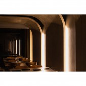
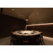
Structural short beams are situated in the public area. The large, curved surfaces are extended and continuously wrap the volume to ease the rigid and oppressive feeling. A flowing arc draws the eye upward and the walls feature a warm gray color scheme that gives off a mellow atmosphere. In the private rooms, dark brown colors create a subdued ambience, and the seamless material makes up the canopy and extends downward to wrap the lighting fixtures, creating a sense of serenity and simplicity. In the shimmering light, one can enjoy a comfortable and relaxing mealtime.
ADDED DATE:
2023-01-12 11:16:18
TEAM MEMBERS (1) :
Toby Lin
IMAGE CREDITS:
SGIANT SPACE DESIGN
|
