The Grey Residential by Kai Yueh Wang |
Home > Winners > #147460 |
 |
|
||||
| DESIGN DETAILS | |||||
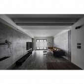
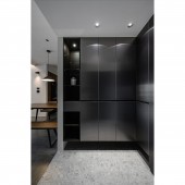
| DESIGN NAME: The Grey PRIMARY FUNCTION: Residential INSPIRATION: The homeowner works in a highly competitive and fast-paced technology industry. In order to slow down life's pace, the colorless space features black, grey and white instead of bright colors to embrace the essence of life. The main wall with hand-brushed special grey paint conveys a rustic and idyllic atmosphere. On the floor, the bursting veins in the charcoal grey stone pattern evoke feelings of strength and reliability. The rough rock texture on the dining sideboard also creates a grey area with strong visual tension and brings a personal touch. A sense of boredom and monotony brought by a monochromatic color palette is removed by combining and mixing different materials. UNIQUE PROPERTIES / PROJECT DESCRIPTION: Through various types of grey scale materials, such as special paint, stainless steel, and stone texture, a pure and stable sense of environment is overlaid onto the color gradients that blend different shades of grey. The mixing of white and warm-toned leather sofas and wood furnishings perfectly softens the rigid grey frame and warms up the space. The layout is rearranged to open up the public space and bring uninterrupted sunlight into every corner of the house. The faint shadows and shades of ink color are stacked sequentially to echo the main color of the space and provide a dynamic change of light and shadow in the static residence. OPERATION / FLOW / INTERACTION: The stainless-steel panels are the doors of the shoe cabinet, and the smooth glossy surface adds a touch of eye-catching shine. The suspended decor idea eliminates the pressure of a large volume. After turning around, the unobstructed layout opens up the room with natural sunlight and provides unobstructed access to the nature views so that residents can come home to a welcoming and relaxing space. The simple and clean TV wall is decorated with hand-painted brush strokes to provide a tranquil and restrained humanistic style without interfering with audio-visual experiences. The minimalist design eliminates excessive cabinets and replaces them with simple shelves and neat TV cabinets to realize the concept of "less is more". The wall behind the sofa is painted with a special pearlescent paint that emits an icy glow under the gentle daylight, making the grey space feels airy rather than giving an impression of heaviness. A timeless personal charm fills the air. The bedroom door is hidden in the grating on the left side. Meanwhile, different materials are joined to create a clear hierarchy. PROJECT DURATION AND LOCATION: The project finished in September 2021 in Hsinchu City, Taiwan. FITS BEST INTO CATEGORY: Interior Space and Exhibition Design |
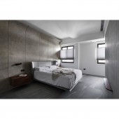
PRODUCTION / REALIZATION TECHNOLOGY: Iron parts, KD solid wood veneer, imported tiles, system boards, art paint SPECIFICATIONS / TECHNICAL PROPERTIES: In the space of 90 square meters, there are an entrance, one living room, one dining room, one kitchen, one study room, two bedrooms and two bathrooms. TAGS: Interior Design, Grey scale, Driftwood, Circular shapes, Environmental protection RESEARCH ABSTRACT: In the bedroom, a wall is built to separate the sleeping area from the dressing room so as to provide ultimate relaxing atmosphere. The TV wall is made of terrazzo stone panels to bring an authentic natural vibe, while the beige paint on the bedside wall differs from the hard texture in the public area. The deep and enveloping earth colors warm up the sleeping area in the presence of light and shadow. The dressing area has the proper width for walking. The reflection of the mirror visually doubles the size of the room and eliminates the suffocating feeling of the narrow space. CHALLENGE: In a cool-toned room, the furniture pieces are made of driftwood, solid wood, and leather to add instant warmth to the living space. Along with the daylight flowing from the large windows, they can balance the cold grey colors in the home without losing its personality. On the living room and the master bedroom ceilings, structural short beams are inserted in circular shapes, which transition the rigid vertical turns to bring smoothness and softness to the eye. The TV wall is also trimmed in the same way. The columns are wrapped, and the curves add dynamic beauty to the tranquil space. ADDED DATE: 2023-01-12 02:48:22 TEAM MEMBERS (1) : Kai Yueh Wang IMAGE CREDITS: VISION PERCEPTION Creation |
||||
| Visit the following page to learn more: http://www.vp-creation.com/ | |||||
| AWARD DETAILS | |
 |
The Grey Residential by Kai Yueh Wang is Winner in Interior Space and Exhibition Design Category, 2022 - 2023.· Read the interview with designer Kai Yueh Wang for design The Grey here.· Press Members: Login or Register to request an exclusive interview with Kai Yueh Wang. · Click here to register inorder to view the profile and other works by Kai Yueh Wang. |
| SOCIAL |
| + Add to Likes / Favorites | Send to My Email | Comment | Testimonials | View Press-Release | Press Kit |
Did you like Kai Yueh Wang's Interior Design?
You will most likely enjoy other award winning interior design as well.
Click here to view more Award Winning Interior Design.


