Silversea Penthouse Residential by Hafi Hakim |
Home > Winners > #146652 |
 |
|
||||
| DESIGN DETAILS | |||||
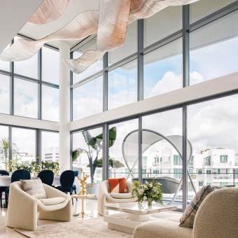
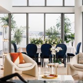
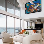
| DESIGN NAME: Silversea Penthouse PRIMARY FUNCTION: Residential INSPIRATION: Nature and the sea were my biggest inspiration when designing this apartment. The penthouse overlooks the coastline of Singapore, and we wanted to bring that element of nature into the interior design. One of the ways that we highlighted this inspiration is with the bespoke light sculpture in the living room. The light sculpture is made up of thousands of individual glass rods that were meticulously and individually installed into mouldable rods by hand. These mouldable rods were then sculpted to create a wave-like affect, giving the owners a sense of the ocean in their home. The light sculpture is comprised of 97% sustainable materials and can be recycled. This was very important to both my client and I, as we wanted to not only create an ode to nature, but to respect it as well. We designed the apartment with soft white hues to ensure that the star of the apartment is the view, and we used furnishings and joineries that complement this. Organically shaped furnishings and decors were also used to soften the angular apartment. UNIQUE PROPERTIES / PROJECT DESCRIPTION: The project objective was to create an elegant home that is soothing and calm, as well as being luxurious; a design where the view of the coastline, that the penthouse overlooks, is the star of the show. Our client is a family of three. A couple, both in their 40’s and a 13 year old son. We were engaged by our clients to perform a full turn-key project. This includes the initial Design Conceptualisation stage including 3D Visualisations. Material Selections for all intended joineries and bespoke furnishings, construction documentations, customisation of furnishings, interior styling services as well as full project management from start to finish. The areas of focus was the Living Room, Dining Room, Outdoor Balconies, Master Bedroom, Son’s Bedroom, Staircase Area as well as the Master Bathroom. The client came to us with clear intent. Firstly, they wanted a place where they can host and entertain many guests. They want their guests to be in awe from the very first moment they step through the apartment entrance. Secondly, They wanted a home they can feel comfortable and calm in. Our clients work long hours and they work mostly from home. So they needed a calm sanctuary when they are out of their home offices. Thirdly, they wanted a home where their teenage son can bring his friends over, and a place where the couple would not have to worry about accidental spills when guests are eating or drinking. The client is also going to be living in the apartment for only two years. So their intent for all new furnishings and built in joineries to be movable and modular to be able to fit future homes if needed to reduce wastage. Most importantly, they wanted a timeless design where the interior does not overshadow the coastal view. The creative direction and concept we developed with the clear intent our client had was to have a white hued home where the colours come in the decors. We wanted a statement and sizeable light sculpture in the living space to fill the double volume void. Performance fabric which was made to be water repellant was specifically imported from Germany to make sure any accidental spills wouldn’t be a worry and also for maintenance purposes. As the house was very angular, with many straight lines, we used organically shaped furnishings and decors to soften the look and to make the space feel less rigid. We also wanted to exude the sense of romantic splendour. The pops of colours which comes in the form of decors also mean that they can be interchangeable easily dependent on mood and time. The unique properties from this design was that all the bespoke furnishings was made from a variety of artisans spanning five different countries. The light sculpture is comprised of almost ninety-seven percent sustainable materials which means that they can (almost) all be recycled. Lastly, the most unique things is that the joineries were specifically build to be modular and easily removable to be able to fit future apartments, reducing waste and making the design even more sustainable. OPERATION / FLOW / INTERACTION: The operations and interaction of the project was very important. This is because we were doing almost all the designs and meetings remotely. We had to ensure all design intent was communicated to the client diligently, and all construction documentations were meticulously explained to the project manager and joiners. As this was the second apartment I have designed for my client and the second time we have worked together, we had a better understanding of how both parties work and how to manage each other’s expectations. This enabled us to make sure things went relatively smoothly as the client gave me her utmost trust, which was even more important when I was not physically present. The project manager on site was essential, as he acted as my representative whilst I was abroad. He made sure that the client felt secure, as well as keeping the client updated constantly on the work happening on site. PROJECT DURATION AND LOCATION: The project started in June 2022 and was completed in November 2022. This is a luxury residential penthouse in Singapore and has a property value of SGD 18 million. FITS BEST INTO CATEGORY: Interior Space and Exhibition Design |
PRODUCTION / REALIZATION TECHNOLOGY: 1. Light Sculpture The light sculpture is made by artisans in China. It is made from glass rods that is recyclable. Before the construction of the sculpture, the sculpture was mapped out on a 3D software to help both the client and I visualise the design intent and to change any designs if needed. It took 2 weeks to install this sculpture. We had to reinforce the false ceiling to make sure it can carry the weight of the sculpture. We also had to change the flow of the modulation as it did not appear as good in person than it did on the 3D walkthrough. This took a lot of time and coordination between the installers and myself. Link to images/videos: http://bit.ly/3GX1Vl SPECIFICATIONS / TECHNICAL PROPERTIES: 2 storey apartment penthouse, 4 bedroom, 5 bathroom, 420 sqm TAGS: Penthouse, Luxury Penthouse, Interior Design, Luxury Interior Design, Residential Design, Luxury Residences, Luxury Apartment RESEARCH ABSTRACT: When we first visited the site; we realized that we had to strip back every false ceiling as there were moulds growing on them. The aircon vents were also all leaking so we had to remove and redo all the ductings for the vents. All the parquet wood flooring in the bedrooms also had to be stripped away as we found traces of termites. This was a major cause as we found that the staircase steps were all hollow due to termite infestations. This realization expanded the budget quite a lot as all wooden joineries going into the house had to be treated to ensure that it would be termite free. The whole house had to be treated to exterminate any traces of termites. After stripping and levelling the floorings; we layed vinyl flooring instead of real wood. This would help in maintenance for the long run. This was the worst case of termite infestation I have ever had on a project and ever since this case, I have had all my projects (be it new or old apartment) go through inspection for any pests. Even though the apartment looks good and clean on first visit and look, deep inspection made us realize that what you see can be misleading and deep inspections is very important for all apartments. CHALLENGE: This design challenges was due to the neutral palette and base. The neutral palette however would mean that every artisan that has curated the pieces seen in this project to work at the highest level; as any imperfection would be apparent and obvious. The water repellent fabrics also had to be used throughout the space to assist in maintenance. ADDED DATE: 2022-11-29 05:14:53 TEAM MEMBERS (1) : IMAGE CREDITS: Marcus L Photography |
||||
| Visit the following page to learn more: http://www.thextonsmithinteriors.com | |||||
| AWARD DETAILS | |
 |
Silversea Penthouse Residential by Hafi Hakim is Winner in Interior Space and Exhibition Design Category, 2022 - 2023.· Read the interview with designer Hafi Hakim for design Silversea Penthouse here.· Press Members: Login or Register to request an exclusive interview with Hafi Hakim. · Click here to register inorder to view the profile and other works by Hafi Hakim. |
| SOCIAL |
| + Add to Likes / Favorites | Send to My Email | Comment | Testimonials | View Press-Release | Press Kit | Translations |
| COMMENTS | ||||||||||||
|
||||||||||||
Did you like Hafi Hakim's Interior Design?
You will most likely enjoy other award winning interior design as well.
Click here to view more Award Winning Interior Design.


