Movie Boxed Campaign by Shaoyang Chen |
Home > Winners > #146280 |
 |
|
||||
| DESIGN DETAILS | |||||
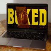
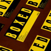
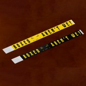
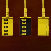
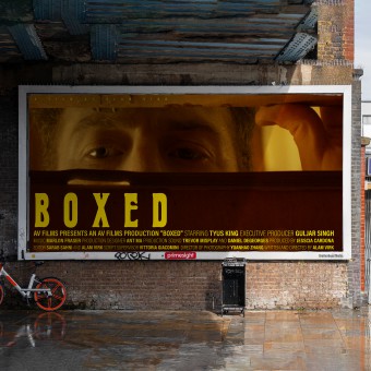
| DESIGN NAME: Movie Boxed PRIMARY FUNCTION: Campaign INSPIRATION: All applications are reinforcement of the idea of being boxed. For the opening title, the main character rips off the film title. For the ending credits, to emphasize the box concept, most typography layouts are rigid box shapes, including punctuation marks. At the premiere night, the stuff pass is tagged with the slogan we are boxed as the punchline for the event. Waistbands that say boxed, aren't we are distributed as the audience enters the screening room. UNIQUE PROPERTIES / PROJECT DESCRIPTION: In this campaign, we aim to bring an immersive experience to the audience at the premiere of the movie Boxed, written and directed by Alam Virk. As we follow the main character, Andy Whiteman, we are forced to confront the reality that we too are often fed with modern culture and trapped in a vacuum of superficial living. Through various mediums, including posters and wristbands with curated copywriting, we seek to reinforce the movie's theme and deepen the audience's understanding of the void state of being portrayed on the screen. OPERATION / FLOW / INTERACTION: Considering this movie is the second film from an award-winning indie director, the whole campaign needs to be tailor-made. The logic of this campaign is to serve the story. Each application speaks to the scene in the movie and emphasizes the box metaphor. PROJECT DURATION AND LOCATION: This project started in August 2022 and finished in November 1, 2022 in New York, NY. |
PRODUCTION / REALIZATION TECHNOLOGY: VFX for Title Sequence and End Credits, Poster, Ticket, Press Pass, Wristband, and Motion Graphics for the Trailer and Bus Stop Advertisement SPECIFICATIONS / TECHNICAL PROPERTIES: 27 x 40 inch Poster, 14 seconds of Title Sequence, 8 seconds of Ending Credits, 6 seconds of Bus Stop Motion Poster, 1 Wristband, 1 Ticket, TAGS: Branding, Campaign, Graphic Design RESEARCH ABSTRACT: For the typeface choice, since the movie color plate is quite vintage and the plot is suffocating, I chose a condensed, thick and historical typeface that fits the movie's story. This campaign also tries to carry the box metaphor throughout. As for the ending credits, most typography layouts are rigid box shapes, including punctuation marks, to emphasize the box concept. Wristbands look similar to handcuffs. And from an architectural standpoint, the screening room is a box made of concrete. To leave more impression on the audience, we also distribute wristbands that say" boxed, aren't we" as they enter the screening room. CHALLENGE: We are faced with the challenge of how to intrigue the audience without telling the full story of the movie. ADDED DATE: 2022-11-04 07:16:57 TEAM MEMBERS (1) : IMAGE CREDITS: Writer and Director / Alam Virk Executive Producer / Guljar Singh Produceder / JR Cardona First Associate Director / Sarab Sahni Second Associate Director / Vittoria Giacomini Script Supervisor / Vittoria Giacomini Production Designer / Ant Ma Production Design Assistants / Erica Zhang & Shuquing Zhang & Laila Matuk Director of Photography / Yuanhao Zhang First Assistant Camera / Ananyaa Dave Gaffer / Aman Tulsian Key Grip / Kgositielle Maleka Best Person / Justin Cambrelen Production Sound / Trevor Misplay & Daniel DeGeorges Coloris / Yuanhao Zhang & Sarab Sahni Editor / Sarab Sahni & Alam Virk Sound Synching / Reuben Rojak Sound FX/ Design Sound Mixing & Music / Marlon Fraser Make-up/Hair / Kelli Hauber PATENTS/COPYRIGHTS: Copyrights belong to Alam Virk and Shaoyang Chen |
||||
| Visit the following page to learn more: https://www.behance.net/gallery/15596953 |
|||||
| AWARD DETAILS | |
 |
Movie Boxed Campaign by Shaoyang Chen is Winner in Advertising, Marketing and Communication Design Category, 2022 - 2023.· Read the interview with designer Shaoyang Chen for design Movie Boxed here.· Press Members: Login or Register to request an exclusive interview with Shaoyang Chen. · Click here to register inorder to view the profile and other works by Shaoyang Chen. |
| SOCIAL |
| + Add to Likes / Favorites | Send to My Email | Comment | Testimonials | View Press-Release | Press Kit |
Did you like Shaoyang Chen's Advertising Design?
You will most likely enjoy other award winning advertising design as well.
Click here to view more Award Winning Advertising Design.


