DESIGN NAME:
College Application
PRIMARY FUNCTION:
Efficiency and Communication
INSPIRATION:
The project was inspired by my experience as a Seneca College student in 2017. I noticed that the existing college apps had usability issues and poor performance, and I believed that a good app for students could significantly enhance their academic experience and college life. My goal was to create an all-in-one solution that streamlines essential services and offers a user-friendly, efficient, and reliable platform. I drew inspiration from my own experiences and extensive research and user feedback to identify key features and functionalities that would benefit the Seneca community and create a design that resonates with users while addressing their unique needs and preferences.
UNIQUE PROPERTIES / PROJECT DESCRIPTION:
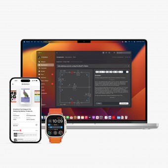
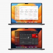
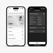
This all-in-one app for college students consolidates essential campus tools and services into a single, user-friendly platform. It seamlessly integrates features like class schedules, campus dining, library access, OneCard management, and more, creating a cohesive and efficient experience for users. Its strengths lie in its intuitive interface, personalization options, and focus on enhancing students' academic experience.
OPERATION / FLOW / INTERACTION:
The Student Apps for iOS and macOS are designed to make life easier for Seneca students. They offer a seamless and intuitive user experience, adapting to different screen sizes and orientations. They adhere to Apple's design guidelines, ensuring smooth operation and fast response times. The apps have been tested and refined based on user feedback and research, resulting in a design that meets the needs and preferences of the target audience.
PROJECT DURATION AND LOCATION:
The project was designed during the summer of 2022 in Newcastle, UK. Updated in March 2023.
FITS BEST INTO CATEGORY:
Interface, Interaction and User Experience Design
|
PRODUCTION / REALIZATION TECHNOLOGY:
The Student app design process involved using Sketch and Figma Jam as primary tools. The project started with a UX discovery phase and involved interviews and user tests with Seneca students. User personas, journeys, wireframes, and prototypes were created for continuous refinement based on feedback. Sketch and Figma Jam enabled seamless collaboration and version control, allowing for responsive designs for various devices.
SPECIFICATIONS / TECHNICAL PROPERTIES:
The project involved creating over 100 mockups, incorporating native components for optimal performance and seamless integration with iOS and macOS. More than 40 participants provided valuable quantitative data through surveys, and over 10 participants participated in qualitative research to shape and refine the app's design and functionality. This comprehensive approach ensured that the final product was tailored to the specific needs and preferences of College students.
TAGS:
macOS, iOS, watchOS, students, college, study, books, fees, payment, meeting, assignment
RESEARCH ABSTRACT:
During the development of the Seneca Student Apps, a comprehensive understanding of users' needs, preferences, and pain points was ensured through various research activities. These included preliminary research, surveys, qualitative research, user personas, user journey mapping, usability testing, and post-launch feedback.
CHALLENGE:
The hardest part of the design activity for the Student apps was balancing the diverse needs and preferences of the target audience while maintaining a cohesive, user-friendly, and efficient experience. With a wide range of features and functionalities to be included in the app, it was essential to prioritize and organize these elements in a way that would not overwhelm users or compromise the overall usability of the platform.
ADDED DATE:
2022-09-30 20:00:24
TEAM MEMBERS (1) :
Pavel Tahil
IMAGE CREDITS:
Pavel Tahil
PATENTS/COPYRIGHTS:
Pavel Tahil
|


