Taipei Medical University Hospital Medical Institutions by Da Yen |
Home > Winners > #145349 |
 |
|
||||
| DESIGN DETAILS | |||||
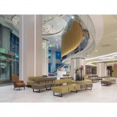
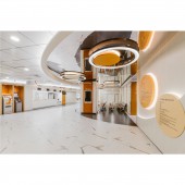
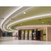
| DESIGN NAME: Taipei Medical University Hospital PRIMARY FUNCTION: Medical Institutions INSPIRATION: In addition to viewing the site as a relay station of lifes migration, the designer believes that the transformation of the boundary between life and death is also the sublimation of the human condition. Therefore, the designer thought of the butterfly that completes its transformation by breaking out from its cocoon, and its beautiful wings and flying posture serves as the inspiration of the spatial context of the hospital. The designer hopes that the butterfly and migration will endow a new sense of reborn hope on the hospital, and a blessing for the next life. UNIQUE PROPERTIES / PROJECT DESCRIPTION: The overall space is divided into three areas with their own theme color green, orange, and blue. Green denotes the main heightened lobby entrance; orange represents the second entrance, and blue represents the third entrance, which is mainly for the Chinese medicine outpatient area. Based on the hospital's existing building space, the designer extended the curves in the shape of butterfly wings and integrated them with the movement flow of the space. In addition to being a decorative spatial element for the ceiling, it also serves as a distinct visual marker for the hospital space. OPERATION / FLOW / INTERACTION: The seating in the lobby was redesigned based on the concept of a tourist hotel. By replacing the original chairs with a continuous curved sequence of sofas, not only can hospital visitors freely enjoy comfortable positions, but the placement also responds to the streamlined spatial patterns. PROJECT DURATION AND LOCATION: The project finished in February 2018 in Taipei, Taiwan. FITS BEST INTO CATEGORY: Interior Space and Exhibition Design |
PRODUCTION / REALIZATION TECHNOLOGY: The original glass railing on the heightened second floor was replaced with a metal grille. In addition to adding a textural layer to the space, it also visually obscures the chaotic and cluttered visual sensation when viewing the second floor from the first floor. It is also worth noting that the butterfly installation art hanging above the ceiling was changed from glass to titanium-plated panels with an acrylic base in the middle and embedded LED lights that change color in rotation, in consideration of subsequent safety issues. SPECIFICATIONS / TECHNICAL PROPERTIES: The project is 595.044 square meter. TAGS: Smart healthcare, theme color, curved sequence, metal grille, circular curve RESEARCH ABSTRACT: The existing harsh right angle of the building structure has been transformed into a circular curve. Above the corridor of the staircase, a lighting panel featuring natural scenes was also designed for the ceiling. It is hoped that these softened designs will transform the public's perception of the hospital as a cold and emotionless place. CHALLENGE: Any medical unit must maintain 24-hour operations, so the designer must consider the construction process to not interfere with the hospitals operating schedule. Therefore, the team could only enter the site on Friday evening every week and work all the way to 4 am. on Monday, including the cleaning of the construction site. A designated work crew was assigned to various locations and completed the work within the expected twelve and a half workdays over a six-week period. In addition, construction safety issues had to be considered during the process, with specific areas of fencing removed and temporary routes planned in advance that would not interfere with the hospitals operations, so as to maintain the hospitals normal operations. ADDED DATE: 2022-09-29 10:31:46 TEAM MEMBERS (1) : IMAGE CREDITS: Image #1-5: Photographer Da Yen, Taipei Medical University Hospital, 2018. |
||||
| Visit the following page to learn more: https://www.yenfaye.com.tw | |||||
| AWARD DETAILS | |
 |
Taipei Medical University Hospital Medical Institutions by Da Yen is Winner in Interior Space and Exhibition Design Category, 2022 - 2023.· Read the interview with designer Da Yen for design Taipei Medical University Hospital here.· Press Members: Login or Register to request an exclusive interview with Da Yen. · Click here to register inorder to view the profile and other works by Da Yen. |
| SOCIAL |
| + Add to Likes / Favorites | Send to My Email | Comment | Testimonials | View Press-Release | Press Kit |
Did you like Da Yen's Interior Design?
You will most likely enjoy other award winning interior design as well.
Click here to view more Award Winning Interior Design.


