DESIGN NAME:
Leverage
PRIMARY FUNCTION:
Office Interior
INSPIRATION:
INSPIRATION:
Office design for LEVERAGE inc. developing the VALX fitness brand that has a passionate fan base in Japan.The office will not only be a place to work, but also a place to learn and socialize.
To express the company's commitment to continually inspiring its customers, the concept was set to "WOW!"
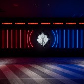
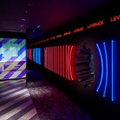
The welcome zone is illuminated with blue and red LED lights representing "calm and passion". The hole in the center of the wall was inspired by the company's expansion through many obstacles.
UNIQUE PROPERTIES / PROJECT DESCRIPTION:
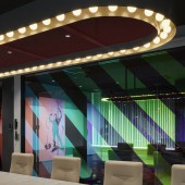
The office serves as a training facility for learning about health, and includes a Youtube studio with training equipment and a seminar room.The seminar room changes its appearance from day to night.
At night, a bar corner will be open to enjoy a moment of conviviality.
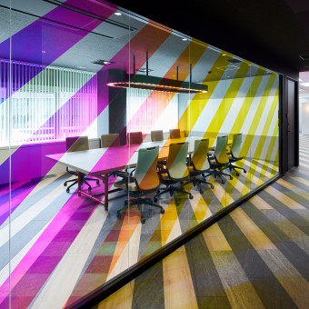
The stripe pattern of the hallway floor runs up the glass of the meeting room. The stripes, covered with a special rainbow-color film, change expression as you walk.
OPERATION / FLOW / INTERACTION:
-
PROJECT DURATION AND LOCATION:
The project started in November 2021 in Shibuya-ku, Tokyo, Japan and finished in March 2022.
FITS BEST INTO CATEGORY:
Interior Space and Exhibition Design
|
PRODUCTION / REALIZATION TECHNOLOGY:
In order to create a variety of atmospheres with little energy, a lighting system that can freely change colors was adopted.
The walls of the meeting room are painted with an environmentally and health-friendly special paint.
To reduce environmental impact, the bar counter made of steel pipes, big tables and custom lighting were reused from the previous office.
Through consideration of materials and lighting plans, we aimed to both enhance the user experience and reduce environmental impact.
SPECIFICATIONS / TECHNICAL PROPERTIES:
The floor area is 407.2 square meters.
TAGS:
Office, interior, lighting, studio, signage
RESEARCH ABSTRACT:
-
CHALLENGE:
We wanted to create an encounter for guests visiting the office with the brand's iconic YouTube studio.
Therefore, we decided to make a three-dimensional hole in the welcome wall in front of the entrance.
The shape of the deep hole was repeatedly studied using computer graphics, and finally completed by hand by craftsmen.
ADDED DATE:
2022-09-28 13:28:54
TEAM MEMBERS (1) :
IMAGE CREDITS:
Design: COTONA Inc.
Photo: Nakasa & Partners
|


