DESIGN NAME:
Yhousedesign
PRIMARY FUNCTION:
Office
INSPIRATION:
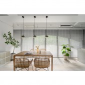
This project is the office of an interior design company, which means that the design team is also the client. The core of the space is to leave a nice first impression on the client. The design team integrated the brand logo to reflect the company's culture. The light green color is complemented by a variety of materials and planting to create a fresh and relaxed atmosphere.
UNIQUE PROPERTIES / PROJECT DESCRIPTION:
The company's logo depicts the key points. These include the spatial expression, the position of the beams, and the presentation of light and shadow. These three key points are represented in this project so that visitors can get a better idea of what the future house will look like. The design team effectively enlarged the horizontal space by removing the partitions. The design team took exposed ceilings to preserve the distance between the ceiling and the floor.
OPERATION / FLOW / INTERACTION:
On the second floor, the key is to bring natural light into the room. The design team created two open areas by the windows to allow natural light to flood into the room. This is followed using glass to create a bright office area and finally a storage area. The layout allows guests coming upstairs to see the natural light from the floor-to-ceiling windows, creating a fresh and relaxed atmosphere.
PROJECT DURATION AND LOCATION:
The project finished in July 2021 in Taiwan.
FITS BEST INTO CATEGORY:
Interior Space and Exhibition Design
|
PRODUCTION / REALIZATION TECHNOLOGY:
Building materials: Benjamin latex paint, system cabinets, iron parts, moru glass, matte glass, clear glass, silver glass, terrazzo, etc. The light tone of the materials creates the illusion of enlarged space. Four different types of glass are used in the partitions, creating a ripple effect of light between penetrating and non-penetrating. In this way, the privacy of each area is preserved while allowing light to pass through the environment.
SPECIFICATIONS / TECHNICAL PROPERTIES:
The project is a pre-owned apartment on the second floor of 49.5 square meters. The project is an open plan with two separate areas for discussion. One is a wooden dining table area for discussions and presentations. The other is a bar-style terrazzo tabletop area for discussion and presentation of projects. Both are different from the formal meeting rooms. The other two partitions are for staff offices and storage. The office is partitioned by clear glass, providing comfort and privacy while letting in light.
TAGS:
Terrazzo, small space, light tone, interior design, cram school.
RESEARCH ABSTRACT:
The design team incorporated the brand's logo, which represents the spatial expression, the position of the beams, and the light and shadow. All three are perfectly represented in the space, with a relaxed atmosphere that allows visitors to get a better idea of what their future home will look like. As an office space for the interior design team, it is not a standard office look but a pleasant green planting at every sight. A comfortable environment can encourage the team to work efficiently. Like an oasis in the desert, the brand is an endless source of design inspiration to inject a fresh green impression into a depleted grey city.
CHALLENGE:
The original site was a cram school. It had many partitions, and the walls were full of foam residue and holes, like a canvas with many stains and holes. The most challenging part of the project was therefore the restoration. The first stage of the restoration was tedious and tiring, but after effectively tidying up the space was clean and tidy. Furthermore, the large floor-to-ceiling windows were retained. With light and shade, the design team was able to be creative on a clean canvas.
ADDED DATE:
2022-09-28 07:45:43
TEAM MEMBERS (1) :
Fan-Yu Shen, Zoey Wu
IMAGE CREDITS:
yhousedesign
|


