DESIGN NAME:
Wen Bo Land
PRIMARY FUNCTION:
Residence
INSPIRATION:
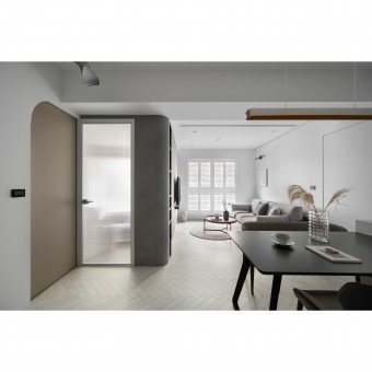
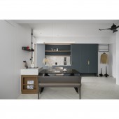
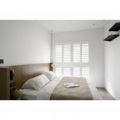
The design team removed part of the interior walls to transform the original 3 plus 2 room layout into 2 plus 2 rooms. They introduced sufficient light in the open-plan public area and shaped the living room and dining room, where people gather, into the core section. The whole space is a modern, low-saturation style, and the white wood flooring makes the space look more spacious. The coffee cabinet with blue and green tones contrasts with the lighter tones of the surrounding area, which is eye-catching and presents the function of the area and the client's living style.
UNIQUE PROPERTIES / PROJECT DESCRIPTION:
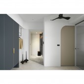
The design team used arc elements in this project to reduce the sharpness of the corners of the ceiling, facade, or cabinetry, thus presenting a smooth layout, walkways, and furniture. Except for the master bedroom, which is a hidden door that provides privacy, other doors are matte glass. The design team discarded the heavy doors and used transparent glass to create a visual effect of spatial extension for the small space. The entrance, public and private areas are in three different colors and flooring methods: mismatched, herringbone, and 1/3 mismatched. The foyer is paved with dark-colored faux stone to resist stains.
OPERATION / FLOW / INTERACTION:
The most satisfying part for the client is the spaciousness. The enlarged living room and restaurant area will not look crowded even if the public area is full of people. At the same time, the spacious space can meet the client's needs of making coffee and cooking for his guests. The ceiling of the living room is lowered about 40cm to conceal the air conditioner. To avoid people feeling uncomfortable, the design team used arcs to eliminate corners and wrap holes to achieve a comfortable visual experience.
PROJECT DURATION AND LOCATION:
The project finished in June 2022 in Taiwan.
FITS BEST INTO CATEGORY:
Interior Space and Exhibition Design
|
PRODUCTION / REALIZATION TECHNOLOGY:
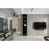
Since the client is a cat lover, the entire flooring is laminate flooring. The facade is scratch-resistant, high-hardness special paint, while the TV wall is decorated with art paint. The rest of the facade is painted white with a gray tone. Furthermore, to create a pet-friendly space, the furniture is made of scratch-resistant materials, even the bottom of the sofa. The coffee cabinet is made of Italian Fenix panels, which have a matte surface and does not reflect light, presenting a low-profile and calm texture. Meanwhile, its surface is no pores to prevent dust, and it is scratch and heat-resistant.
SPECIFICATIONS / TECHNICAL PROPERTIES:
This project is a newly completed apartment on the 2nd floor. The actual area is 76 square meters, with a layout of 2 bedrooms, a living room, a dining room, and 2 bathrooms. The design team transformed the original layout of 3 bedrooms, 2 living rooms, and 2 bathrooms. They removed one of the partitions to reorganize the space and moved the facade of the master bedroom and the second bedroom to make the living and dining areas more spacious.
TAGS:
Rounded edges, Fenix panels, coffee cabinet, herringbone flooring, MUJI style.
RESEARCH ABSTRACT:
The open plan allows natural light to flood every corner of the space. The design team adopted a modern, low-saturation style to create a fresh and bright atmosphere. The Morandi blue-green coffee cabinet is a highlight in the light-colored space and echoes the client's hobby. The design team incorporated arc elements in the corners of ceilings, facades, and cabinets to eliminate sharp corners and beams. The curves soften the vision and enlarge the space. At the same time, the matte glass doors improve the lighting. Used three colors and flooring patterns to interpret the entrance, public and private areas.
CHALLENGE:
The project was challenging in terms of convincing the client to accept the drastic changes and in terms of scheduling the construction workforce. First, the original layout was not sufficiently lighted, so the partitions had to be removed. In addition, the construction period coincided with the Lunar New Year and the epidemic outbreak, so the work shifts had to be split due to epidemic prevention considerations. Under such circumstances, it was necessary to rely on the trust and cooperation among all the team members and the client to synchronize the progress.
ADDED DATE:
2022-09-27 09:06:44
TEAM MEMBERS (1) :
Yu-Ting Lee
IMAGE CREDITS:
Zingidea interior design
|
