Utopia Residential House by Fei Zhao |
Home > Winners > #145030 |
 |
|
||||
| DESIGN DETAILS | |||||
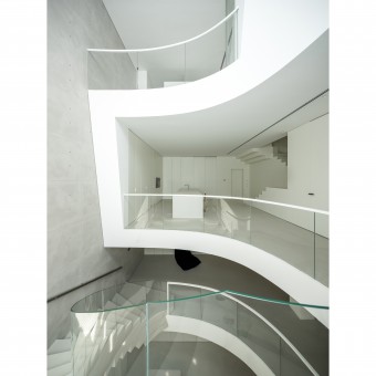
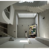
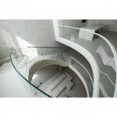
| DESIGN NAME: Utopia PRIMARY FUNCTION: Residential House INSPIRATION: The radiant natural light is the source of the form of this space. An organic, inclusive space was the feeling we wanted to create, so we also compared a lot of organic space practices, including the positioning of the construction drawings. UNIQUE PROPERTIES / PROJECT DESCRIPTION: As a narrow north-south facing townhouse, the original building has 4 floors, 2 above ground and 2 below (the basement has a height of 5.5m and can be divided into 2 floors with only a small patio to provide light). Facing south as the main direction of light, it relies on a stairwell to connect the various floors and comes with a lift. After observing the site and realizing that no well landscape was around the site, we decided to make an Inward facing construction within it. OPERATION / FLOW / INTERACTION: In terms of functional distribution, we clearly divide the functional areas of each floor, which are both independent and well-connected. The 1st floor and the 2nd floor underground are the main floors for daily access, serving as public spaces, while the relatively independent 2nd floor serves as residential spaces. Owners also have the need for daily gatherings, so we try to make each functional area larger.The staircase has been redesigned to provide a more comfortable connection of traffic flow between the functional areas on each level. PROJECT DURATION AND LOCATION: The project started on October 17th 2020 and finished on August 1st 2021 in Zhengzhou, China. FITS BEST INTO CATEGORY: Interior Space and Exhibition Design |
PRODUCTION / REALIZATION TECHNOLOGY: The curved wall and the laminated cast-in-place revolving staircase were a very big challenge for this project in terms of landing. First of all, the curved wall is an irregular shape, and the boundary of each floor has different positioning dimensions. In order to keep the errors to a minimum, the builder used ropes to locate the 2 layers connected to the basement at multiple points while positioning according to the drawings, just to ensure the coherence of the curved walls. For the construction drawings, we refer to the positioning method of Toyo Ito’s construction drawings, the contour grid positioning method. SPECIFICATIONS / TECHNICAL PROPERTIES: Indoor area 420 ㎡ TAGS: Organic, light and shadow, lighthearted, sculptural, textural contrasts RESEARCH ABSTRACT: We focus on the impact of light on the residential environment, taking sunlight as a case study, by observation of the duration and direction of sunlight at the winter and summer solstices. CHALLENGE: Guiding the constructor to land our project, and connecting with the structure and electromechanical team, both are hard nuts for us to crack. There are many first attempts for us, also for our constructor. ADDED DATE: 2022-09-27 06:04:12 TEAM MEMBERS (1) : Designer: Ran Chen IMAGE CREDITS: Photographic institutions:WMstudio PATENTS/COPYRIGHTS: Design copyright: 323studio |
||||
| Visit the following page to learn more: http://323studio.mystrikingly.com/ | |||||
| AWARD DETAILS | |
 |
Utopia Residential House by Fei Zhao is Winner in Interior Space and Exhibition Design Category, 2022 - 2023.· Read the interview with designer Fei Zhao for design Utopia here.· Press Members: Login or Register to request an exclusive interview with Fei Zhao. · Click here to register inorder to view the profile and other works by Fei Zhao. |
| SOCIAL |
| + Add to Likes / Favorites | Send to My Email | Comment | Testimonials | View Press-Release | Press Kit | Translations |
Did you like Fei Zhao's Interior Design?
You will most likely enjoy other award winning interior design as well.
Click here to view more Award Winning Interior Design.


