DESIGN NAME: Snow Zero
PRIMARY FUNCTION: Packaging
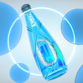
INSPIRATION: The hard sparkling water is subtly named as Zero to symbolize the midnight, a time to enjoy revelry and welcome a new day. The continuation Zero implies is encapsulated and visualized by the infinity symbol, to connote the endless enjoyment offered by the hard sparkling water. For stronger aesthetic appeal, the figure 0 takes on the font effect of 3D liquid metal, which exudes a striking futuristic style to make the package design match the consumption scenariosmore closely.
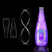
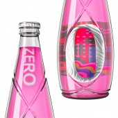
UNIQUE PROPERTIES / PROJECT DESCRIPTION: Zero is the low alcohol and low calorie hard sparkling water dedicated to the z generation. Its package design features the infinity symbol, which vividly interprets the endless happy hours consumers can get when savoring the hard sparkling water. Additionally, the illustrations on bottles are elaborately designed based on pioneer visual art such as Expressionism and Memphis, creating strong aesthetic appeal to the z generation who have a fancy for pretty things.
OPERATION / FLOW / INTERACTION: With the uniquely designed water drop shape, any two bottles can be connected mouth to mouth to form a new infinity symbol. This subtle shape design boasts much playfulness, and offers every consumer a new approach to socializing and interacting with others.
PROJECT DURATION AND LOCATION: The design and development of ZERO started in Beijing, in September 2021. It will be introduced to the market in China, in August 2023.
FITS BEST INTO CATEGORY: Packaging Design
|
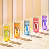
PRODUCTION / REALIZATION TECHNOLOGY: aluminum can and glass bottle
SPECIFICATIONS / TECHNICAL PROPERTIES: Bottle: 288 ml height- 222 mm
Can: 330 ml height- 145 mm
TAGS: Alcohol Packaging, Gen Z, Hard Sparkling Water, Pioneer Visual Art, Font Effect of 3D Liquid Metal
RESEARCH ABSTRACT: In light of the preferences of the z generation, the design team labeled the hard sparkling water as ZERO to denote the infinite enjoyment it brings and the midnight for people to indulge in revelry. The ZERO is expected to create a mental habitat for the z generation to take their stress and disguise off and to show their true personalities in the leisure moments.
CHALLENGE: The challenge of the project laid in how to stand out in the crowded market of essentially identical products and to catch eyes of consumers in the consumption scenarios. For this end, the package design applies the font effect of 3D liquid metal on the figure 0 to visually convey the low calorie and refreshing taste of the product, quite striking and impressive. The illustrations of various art styles are also adopted to reinterpret what the ZERO can be, exuding a coherent vibe of futurism.
ADDED DATE: 2022-09-13 01:16:41
TEAM MEMBERS (3) : Dong Yan, Weixi Zhou and Yu Zhai
IMAGE CREDITS: China Resources Snow Breweries Ltd., 2022.
|