DESIGN NAME:
Mizone Seasonal
PRIMARY FUNCTION:
Beverage
INSPIRATION:
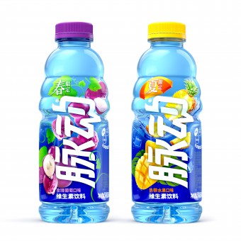
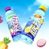
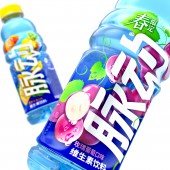
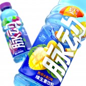
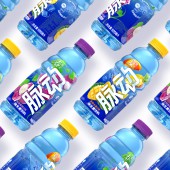
The creative concept of spring limited rose grape flavor is spring revival. The wildly growing grape vines set off the spring limited icon. They grow up while wind around the wet grapes. The growing tendency is corresponding to Mizone pulse on core line. Based on Mizone blue, a large scale of fashionable pinky purple is added to create a spring exclusive romantic atmosphere as well as is associated with the refreshing fruity flavor from rose grape. The creative concept of summer limited tropical fruit flavor is summer refreshing. Mango, pineapple and ice smash into water and cause ripples in water. The yellow from tropical fruits is bright, attractive and appetizing when being set off by Mizone blue water flow and ice. The summer limited icon on beach umbrella communicates the cooling and refreshing idea of playing with water in summer.
UNIQUE PROPERTIES / PROJECT DESCRIPTION:
Seasonal marketing gains popularity among Chinese consumers and convenient stores. Many brands release limited edition products to keep up the trend. Mizone has been the leading vitamin drink brand in China for 20 years. It’s popular due to its thirst quenching attribute and refreshing taste. To infuse the brand with new excitement, Mizone launches spring and summer limited edition on market. The packaging breaks Mizone’s brand-driven design principle by maximizing the appetizing seasonal flavor and seasonal association as well as remaining the brand recognition.
OPERATION / FLOW / INTERACTION:
In Spring, convenient stores are filled with pink packaging and point-of-sale which create a girly environment. As vitamin drink, Mizone's seasonal edition should take vitality into consideration and create differentiation on market. Spring edition takes the growing grape vine to show the revitalization and is more relevant to Mizone brand. It can stand out among the soft and girl spring seasonal shelf. When it comes to summer, the packaging keeps the design principle, and its theme focuses more on beach. The wave and beach elements remind consumers of the refreshing taste and bring cool feeling in hot summer.
PROJECT DURATION AND LOCATION:
Spring project started in September 2021 and launched in March 2022. Summer project started in November 2021 and launched in May 2022.
FITS BEST INTO CATEGORY:
Packaging Design
|
PRODUCTION / REALIZATION TECHNOLOGY:
PET bottle covered with shrink film
SPECIFICATIONS / TECHNICAL PROPERTIES:
Width 7cm x Height 21cm
TAGS:
Packaging, vitamin, seasonal, limited edition
RESEARCH ABSTRACT:
Based on desk research, the team finds out that convenient stores are filled with cherry blossom flavored beverage in spring. As a result, convenient stores are filled with pink packaging and cherry blossom graphic. The overall tonality is mild and soft. So it is essential to find a way to create differentiation. Grape flavor is purple, and grape vine has the power of growing. These elements bring vitality and unique color block on shelf, which allows the limited edition to stand out. Summer flavor keeps the design principle and mixes the summer elements into packaging design.
CHALLENGE:
Seasonal flavor is not something special in China. When it comes to specific season, offline channels are full of seasonal flavor products. The team finds out that these packaging look similar and lack brand personality. Therefore, the team infuses the Mizone's brand personality - revitalization and vitality into the packaging, which makes Mizone's seasonal packaging branded and outstanding on shelf.
ADDED DATE:
2022-08-01 08:14:50
TEAM MEMBERS (6) :
Creative Director: Yang LI, Designer: Xuying ZHANG, Designer: Yu KANG, Account Management: Yufan WANG, Strategic Planner: Xincheng ZHUANG and 3D rendering: Sheng WAN
IMAGE CREDITS:
Blackandgold Design (Shanghai) Co., Ltd., 2022.
|


