DESIGN NAME:
Track of Time
PRIMARY FUNCTION:
Watch Store
INSPIRATION:
The design of the space interprets the interrelationship between space and exhibits through the interweaving of imagery and figurative meanings. The theme is brought out through the extreme, sophisticated, and unique characteristics of a luxury boutique. Firstly, the design is laid out in grey tones, followed by a subtle spread of different materials to bring out the diverse artistic aspects between 'fine watches' and 'time'.
UNIQUE PROPERTIES / PROJECT DESCRIPTION:
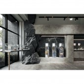
Through the polystyrene stone artwork, the designer injected a brand-new atmosphere into the space. Rather than just an exhibition, the designer focused on the atmosphere of the space that leads to the feeling of the products. By planning the path, texture, and configuration, visitors are guided to the products. The interior design not only expresses the brand's emphasis on texture and depth but also provides visitors with a high level of privacy and VIP privilege like an art gallery. Surrounded by a cozy atmosphere, each visitor can find the ideal piece of collection more smoothly.
OPERATION / FLOW / INTERACTION:
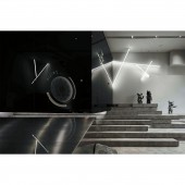
The original base is a square space for exhibition and sales. The design of this project is to present a gradual change of spatial atmosphere with distinctive layering and various undulations through ingenious planning. Firstly, the designer configured the exhibition and sales space with an open plan. Then, through the staircase setting, the path of space is no longer tedious. Finally, the main tone of gray stainless-steel panels, gray mirrors, and melamine panels inject a unique atmosphere of the same tone and different materials into the space.
PROJECT DURATION AND LOCATION:
The project finished in September 2021 in Taiwan.
FITS BEST INTO CATEGORY:
Interior Space and Exhibition Design
|
PRODUCTION / REALIZATION TECHNOLOGY:
Digitally cut polystyrene. Stainless steels. Melamine. Cabinets. Tiles. Linear lighting bar. Modeling light fixture.
SPECIFICATIONS / TECHNICAL PROPERTIES:
As a commercial space for boutique watches, it has a display area, counters, sofa area, storage area, stairs, pantry area, and lavatory. The interior is characterized by unique imagery of stone made of polystyrene. At the same time, the irregular staircase facade subtly reflects the diversity of gray colors. In addition, the designer also uses black mirrors, linear light strips, faux stone art installations, and multi-layered stairs to create a glass box-like sophistication and extravagance.
TAGS:
Commercial space, Fine display, Grayscale Modern, Track of Time, Modernity.
RESEARCH ABSTRACT:
As a venue for fine watches and luxury goods, the designer created a grand atmosphere of restrained luxury through a variety of grayscale tones. To create a relationship between the environment and the products, the designer delicately carved out the image of 'time' through symbols such as 'passing' and 'track'. Meanwhile, the linear lighting, grayscale melamine panels, and faux finishes gradually lead visitors into an immersive shopping experience. The shopping space not only focuses on the products but also brings out a more intuitive brand tone and tension through space planning.
CHALLENGE:
The challenge was to integrate the luxury brand tone into the space while showing strength and texture through materials and layout. The designer used gray as the main tone and used faux stone installation art to reflect the imagery and characteristics of the space. Moreover, under the continuation of the same tone and different materials, the elements such as mirrors, lamps, titanium plating, melamine, and tiles outline a varied grayscale texture. In this way, the spatial intensity is strengthened and the spirit of the brand is embodied in the comprehensive conception of deep and light.
ADDED DATE:
2022-06-30 09:31:04
TEAM MEMBERS (1) :
HERS INTERIOR DECORATION
IMAGE CREDITS:
HERS INTERIOR DECORATION INDUSTRY Limited Company
|


