Sisu Hair Salon by Jun Kameda |
Home > Winners > #142733 |
 |
|
||||
| DESIGN DETAILS | |||||
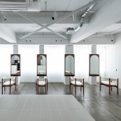
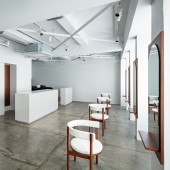
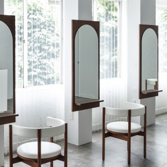
| DESIGN NAME: Sisu PRIMARY FUNCTION: Hair Salon INSPIRATION: The tenant space before renovation had windows hidden with built-in walls and exterior signboards which made a dim interior. However the potential was at the wide windows to let in natural light. Thus the interior/exterior was adjusted to add a sense of openness and take advantage of the windows to become a symbolic feature of the space. Hair salons have few furniture features compared to other shop formats. To assure uniqueness with limited budget, the design fundamental was at the originally designed chairs, to become an iconic feature for Sisu and influence other design details within the one-room space to realize interrelation. UNIQUE PROPERTIES / PROJECT DESCRIPTION: The overall design concept for Sisu was to fill the space including the skeleton and built in walls with white like a canvas and compose furniture upon it. The space aims to be sustainable by its minimalism. The chairs and other interior features are designed to be easily maintenanced for a prolonged period of time. The initial interior design is limited to very few materials and reduced decorativity, eventually emphasizing the wooden features and tidiness. OPERATION / FLOW / INTERACTION: SISU was designed to be run by the owner alone. Thus the focus was on his operation flow efficiency and to allow awareness towards customer's situation despite their or owner's position in the salon space. The concrete skeleton floor was polished then coated with clear urethane to be finished, making it easy to sweep cut hair. The vertical window blinds control natural light intensity and lets it be the main light source especially during daytime. It makes natural light become an essential factor of the space identity regardless of time period, and also accentuates the window view of outside trees. PROJECT DURATION AND LOCATION: The project started in January 2021 and finished in July 2021 at Nagoya, Aichi, Japan. FITS BEST INTO CATEGORY: Interior Space and Exhibition Design |
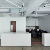
PRODUCTION / REALIZATION TECHNOLOGY: The concrete skeleton floor was polished then coated with clear urethane to be finished. The wooden chair and mirror uses dyed lauan plywood. SPECIFICATIONS / TECHNICAL PROPERTIES: Total floor area: 61.52 square meters TAGS: interior design, furniture design, hair salon, minimalist design, renovation RESEARCH ABSTRACT: - CHALLENGE: Average Japanese beauty salons tend to place a table, usually functioning as a consultation area, facing the entrance. To break the stereotype, a large white tile-covered rectangular solid was installed at Sisu and let it function more than just a consultation space, such as a work desk for operation besides haircut, or a display platform to put flowers and art objects. It may be a small challenge, but had a considerable effect on the entire space. In combination with the furniture’s deep wooden color, it adds a comfortable feel to the refined white space unlike other beauty salons as if users are at a familiar residential space. ADDED DATE: 2022-06-29 10:57:34 TEAM MEMBERS (1) : Jun Kameda IMAGE CREDITS: Photographer Kenta Hasegawa PATENTS/COPYRIGHTS: Copyrights belong to SISU / STUDIO ALUC 2022 |
||||
| Visit the following page to learn more: https://bit.ly/3vG3IEB | |||||
| CLIENT/STUDIO/BRAND DETAILS | |
 |
NAME: Sisu PROFILE: Sisu is a hair salon located in Aichi, Japan by Hideyoshi Nawa. It opened in July 2021. |
| AWARD DETAILS | |
 |
Sisu Hair Salon by Jun Kameda is Winner in Interior Space and Exhibition Design Category, 2022 - 2023.· Read the interview with designer Jun Kameda for design Sisu here.· Press Members: Login or Register to request an exclusive interview with Jun Kameda. · Click here to register inorder to view the profile and other works by Jun Kameda. |
| SOCIAL |
| + Add to Likes / Favorites | Send to My Email | Comment | Testimonials | View Press-Release | Press Kit | Translations |
Did you like Jun Kameda's Interior Design?
You will most likely enjoy other award winning interior design as well.
Click here to view more Award Winning Interior Design.


