Kc Group Workplace by Yan De Jiang |
Home > Winners > #142726 |
 |
|
||||
| DESIGN DETAILS | |||||
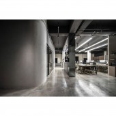
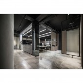
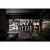
| DESIGN NAME: Kc Group PRIMARY FUNCTION: Workplace INSPIRATION: By using building materials to break through frames, the team made visual impact and imagery with interior design and high tech style. The exterior with imitation fair faced concrete delivers modesty and simplicity. The iron pieces shape geometric lines, with light stripes, the line extends from the exterior to the interior in a L shaped direction, unveiling brand identity, moreover creating an image of the milky way. UNIQUE PROPERTIES / PROJECT DESCRIPTION: For the exterior, colorful granite paints and iron pieces were used, light strips extended from the exterior to the interior, which symbolizes interior traffic flow, divides areas, and creates frames also. For the interior, imitation fair faced concrete, solid wood, and iron pieces were utilized. The modern industrial style with streamline design gives a fresh look and breaks down the traditional office concept. OPERATION / FLOW / INTERACTION: The ground floor has lobby, office rooms, meeting room, kitchen, and bar; chairman room, supervisor room, staff room, restrooms, and kitchenware area are on the second floor; the third, fourth floor, and fifth floor are arranged as warerooms, restrooms, and engine rooms. PROJECT DURATION AND LOCATION: The project finished in June 2021 in Kaohsiung, Taiwan. FITS BEST INTO CATEGORY: Interior Space and Exhibition Design |
PRODUCTION / REALIZATION TECHNOLOGY: In order to improve damaged walls and lighting, firstly the team conducted seven processes, such as covering tiles with imported paints, besides, they strengthened waterproofing work to protect old facade, and rearranged plumbing pipes. SPECIFICATIONS / TECHNICAL PROPERTIES: The project is 1322.32 square meter. TAGS: Iron, Geometric lines, Imitation fair faced concrete, Gray tone, Wood veneer RESEARCH ABSTRACT: In the area between black, grey, and white, the leave blank design and minimal decoration injects calm into the interior, interpreting the concept of human-centered design, reflecting the values of colors, textures, and light and shadow. Making the design simple, the team defined styles through imitation fair-faced concrete, wood veneer, iron piece, and grey mirror and glass elements, maintaining consistency and giving richness to the design. CHALLENGE: With cohesive elements, the team added harmonious and serene style to the interior, showing various characteristics of building materials. Furthermore, they created interesting visual effects by dropping shadows on white background. ADDED DATE: 2022-06-29 10:13:07 TEAM MEMBERS (1) : IMAGE CREDITS: Image #1-2: Photographer Yan-De Jiang, Kc Group, 2021. |
||||
| Visit the following page to learn more: https://www.realhouse-design.com/ | |||||
| AWARD DETAILS | |
 |
Kc Group Workplace by Yan De Jiang is Winner in Interior Space and Exhibition Design Category, 2022 - 2023.· Read the interview with designer Yan De Jiang for design Kc Group here.· Press Members: Login or Register to request an exclusive interview with Yan De Jiang. · Click here to register inorder to view the profile and other works by Yan De Jiang. |
| SOCIAL |
| + Add to Likes / Favorites | Send to My Email | Comment | Testimonials | View Press-Release | Press Kit |
Did you like Yan De Jiang's Interior Design?
You will most likely enjoy other award winning interior design as well.
Click here to view more Award Winning Interior Design.


