Formula Store by Hsu Ti-Pin |
Home > Winners > #142659 |
 |
|
||||
| DESIGN DETAILS | |||||
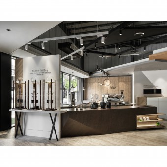
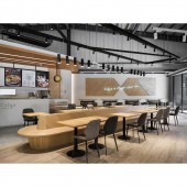
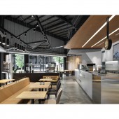
| DESIGN NAME: Formula PRIMARY FUNCTION: Store INSPIRATION: The chain's name is Cuiqu, is the Chinese word for Extraction in Romanization system; is also the root of the brand. In order to combine the brand story with the building volume, the imagery and the materialization of the word Extraction has become the core of the inspiration. The existing frame is surmounted via stripping off the geometric blocks from the main structure, and combining different materials to create a multi-layered reality. UNIQUE PROPERTIES / PROJECT DESCRIPTION: This project is a chain store coffee brand. it is an independent building with a raised height of 6.5m, where the two sides facing the roads both feature a large area of windows for lighting; the simple and well-executed black, grey, and white looks of the structure turns it into a popular check-in spot soon after its completion. It is decorated with triangular 3D geometric forms resembling an hourglass, implying the image of ice drip coffee which the cafe specializes in. OPERATION / FLOW / INTERACTION: In order to correspond to the golden block environment and to optimize the brand image, an image wall with the ice drip coffee logo welcomes the guests at the entrance while adequately embellishing the dynamics of the personnel in the open coffee zone behind the wall. The sofa booth seating area applied a horizontal triangular montage on the back wall, reinforcing the image of an ice drip coffee maker while extending the brand concept a step further. PROJECT DURATION AND LOCATION: The project finished in 2021, in Taichung City, Taiwan. FITS BEST INTO CATEGORY: Interior Space and Exhibition Design |
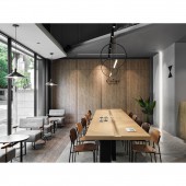
PRODUCTION / REALIZATION TECHNOLOGY: The greenish-grey section for the top of the building is made with metal corrugated boards, while the weather-durable white middle section applied granite paint decorated with linear arrays and the name of the cafe with backlighting to enhance the visual layers. The inside of the cafe applied a soft white tone with a massive amount of mellow wooden texture for overlapping volume and decoration design, which is decorated with metal lights and greyish-blue brand logo…etc. SPECIFICATIONS / TECHNICAL PROPERTIES: The property is about 305 square meters. TAGS: Interior Design, Cafe, White tone, Wooden texture, Modern style RESEARCH ABSTRACT: In order to relieve the severe sun exposure on the west wing of the building, the space is deliberately retreated to form a raised semi-alfresco area, where the square mirror set up on top of the semi-alfresco area is capable of mirroring the prosperous trees from different angles. A rectangular window is designed by the corner to ingeniously incorporate the tranquil postures of the trees indoors, where one can experience the different window views along with the change of the seasons. CHALLENGE: For a commercial dining space, how to cater to the accommodation capacity of customers, the degree of comfort, the brand image and the profit of the proprietor under the criteria of a certain space and budget are all key points to be considered. Therefore, other than clearly dividing the work zone for the planning of an independent cafe, it can also increase the interaction between the buyer and the seller, offering a relatively flexible spatial arrangement. ADDED DATE: 2022-06-29 03:17:41 TEAM MEMBERS (1) : Hsu Ti-Pin IMAGE CREDITS: Liu Po-Nien |
||||
| Visit the following page to learn more: https://www.muyicreation.com | |||||
| AWARD DETAILS | |
 |
Formula Store by Hsu Ti-Pin is Winner in Interior Space and Exhibition Design Category, 2022 - 2023.· Read the interview with designer Hsu Ti-Pin for design Formula here.· Press Members: Login or Register to request an exclusive interview with Hsu Ti-Pin. · Click here to register inorder to view the profile and other works by Hsu Ti-Pin. |
| SOCIAL |
| + Add to Likes / Favorites | Send to My Email | Comment | Testimonials | View Press-Release | Press Kit | Translations |
Did you like Hsu Ti-Pin's Interior Design?
You will most likely enjoy other award winning interior design as well.
Click here to view more Award Winning Interior Design.


