Holo Penetration Store by Yang Hsiang-Yu |
Home > Winners > #142623 |
 |
|
||||
| DESIGN DETAILS | |||||
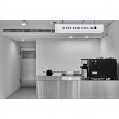
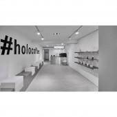
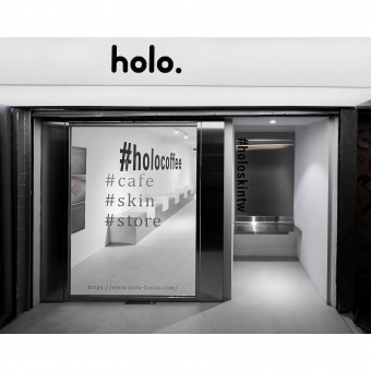
| DESIGN NAME: Holo Penetration PRIMARY FUNCTION: Store INSPIRATION: The pure white base reminiscent of the complex of the new born and the minimalist lines giving a cool sense of technology are the inspiration of this project. UNIQUE PROPERTIES / PROJECT DESCRIPTION: This project is a renovation of the 1st floor of an old street house store. holo is a brand, features a line of products comprising cosmetic products, skin care products, and cups of which naturalness, organic-ness and environment friendliness are the emphasis. Given the heating competition on the beauty and personal care market, decided to break away from the usual brand counter, but to run a complex fashionable coffee shop where products are sold and a photo-shooting corner is provided. OPERATION / FLOW / INTERACTION: The front facade of the shop keeps a bit of distance from the road and is one step higher the slightly elevated horizontal view deepens the visual feeling of the audiences. The entrance to the right side stands 1.5 meters further back, requiring taking a turn before entering through the front door; such a unique design of traffic flow makes the entrance a semi-outdoor corner for photo shooting and check-in, with the laser-etched letters of the brand name being the background. PROJECT DURATION AND LOCATION: The project finished in Jan 2022, in Taipei City, Taiwan. FITS BEST INTO CATEGORY: Interior Space and Exhibition Design |
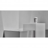
PRODUCTION / REALIZATION TECHNOLOGY: Materials used for renovation are low-formaldehyde green materials. For instance, the side wall at the entrance door is made of environmentally friendly wood-plastic composite. The several elevations which feature a 3-dimensional design are covered in silver, an efficient stainless steel finish. The wall facades and floor across the shop are renovated using environmentally friendly cements, the bright color of which effects a spatial magnification effect. SPECIFICATIONS / TECHNICAL PROPERTIES: The property is about 33 square meters. TAGS: Interior Design, Coffee store, Environmentally friendly, Skin care products, Modern style RESEARCH ABSTRACT: At the two side walls of the shop stand highlights of functions: at one side of the wall lie dining sets reminiscent of geometrically dimensional battements, with benches being covered in silver stainless steel and the cubic-shaped white matte acrylic table being mounted; this is where visitors usually take a break and enjoy coffee and light meals. The large black letters of the brand name attached on the wall also give a sense of trendiness. CHALLENGE: The cashier counter is also the coffee-making area; the counter volume is also covered with stainless steel. To ensure the smooth operations of the water sink, workbench and storage cabinet at the back of the counter, the water pipes are extended from the water supply source at the back. A linear diffuser is also installed on the top. The project, although completed with a friendly budget, is good value for money in that it gives a quality to the space and is iconic and thus a great innovation of brand image building. ADDED DATE: 2022-06-28 19:10:17 TEAM MEMBERS (1) : Yang Hsiang-Yu IMAGE CREDITS: The One Creative Interior Design Co., Ltd. |
||||
| Visit the following page to learn more: https://panyi-architecture.com/ | |||||
| AWARD DETAILS | |
 |
Holo Penetration Store by Yang Hsiang-Yu is Winner in Interior Space and Exhibition Design Category, 2022 - 2023.· Read the interview with designer Yang Hsiang-Yu for design Holo Penetration here.· Press Members: Login or Register to request an exclusive interview with Yang Hsiang-Yu. · Click here to register inorder to view the profile and other works by Yang Hsiang-Yu. |
| SOCIAL |
| + Add to Likes / Favorites | Send to My Email | Comment | Testimonials | View Press-Release | Press Kit | Translations |
Did you like Yang Hsiang-Yu's Interior Design?
You will most likely enjoy other award winning interior design as well.
Click here to view more Award Winning Interior Design.


