Ink Highlight Residential by Kan Shih Ming |
Home > Winners > #142558 |
 |
|
||||
| DESIGN DETAILS | |||||
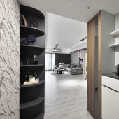
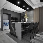
| DESIGN NAME: Ink Highlight PRIMARY FUNCTION: Residential INSPIRATION: Through the balcony windows, daylight leaks into the room, its brightness undulating with the passage of day. This daylight adds a smooth white haze to the space, and the dimness of the living room is like light grey ink fading into the air, layering the depth of color harmony. UNIQUE PROPERTIES / PROJECT DESCRIPTION: For this standard urban modern house, the design concept places an emphasis on optimal space distribution for family interaction and cohesion, allowing family members to gather easily and comfortably. Function is first, and then the aesthetics is carefully considered to balance the spatial needs and visual enjoyment of the owner. OPERATION / FLOW / INTERACTION: The design focus of the public domain is a large functional complex serving as a dining table, a center island, and a bar. In terms of visual layout, the entire surface of the large dining table is made of a splash-ink-landscape Italian marble board that is parallel to the corresponding ceiling beams which are covered with black mirrors. The splash-ink-landscape texture extends from the surface to the L-shaped table legs on the side. It elevates the experience of the entire public domain. PROJECT DURATION AND LOCATION: Construction: 2021.08 Completion: 2021.09,Taiwan FITS BEST INTO CATEGORY: Interior Space and Exhibition Design |
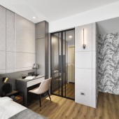
PRODUCTION / REALIZATION TECHNOLOGY: The main vision is the "Italian thin tiles" with ink patterns on the dining table panel. The ink patterns are continued with the beige stone TV wall, and the natural pattern wallpapers are used to maintain the overall consistency. SPECIFICATIONS / TECHNICAL PROPERTIES: 150 square meters TAGS: Ink highlight, Silent White, Residential, Daylight, Ink RESEARCH ABSTRACT: The public domain is the soul of the space. No boundary is set between the dining room and the living room in order to give the room a spacious impression while maintaining all the daily living functions. To highlight a visual proportion of weights, the color palette is centered on white and embellished by different greys. Some warmth from wood materials balance the sharpness of the black and grey tones. Materials such as the metal lights and the ceiling rendering belt, are drawn to enliven the modern space. CHALLENGE: The original structure has a layout made up of beams and columns at the corners, such as the porch, kitchen entrance, windowsills and bed board area in the rooms. These irregular structures are rearranged to accommodate shoe cabinets in the porch, storage cabinets in the kitchen, a circuit box for the air conditioner, a partition for the walk-in closet, and a bedside cabinet. By repurposing the corner spaces, efficient distribution is achieved and spatial shortcoming is avoided. ADDED DATE: 2022-06-28 08:32:59 TEAM MEMBERS (1) : Kan Shih Ming IMAGE CREDITS: Photographer: Blake Wang PATENTS/COPYRIGHTS: KAN SHIH MING,2019 |
||||
| Visit the following page to learn more: http://www.tcid-asia.com/ | |||||
| AWARD DETAILS | |
 |
Ink Highlight Residential by Kan Shih Ming is Winner in Interior Space and Exhibition Design Category, 2022 - 2023.· Read the interview with designer Kan Shih Ming for design Ink Highlight here.· Press Members: Login or Register to request an exclusive interview with Kan Shih Ming. · Click here to register inorder to view the profile and other works by Kan Shih Ming. |
| SOCIAL |
| + Add to Likes / Favorites | Send to My Email | Comment | Testimonials | View Press-Release | Press Kit |
Did you like Kan Shih Ming's Interior Design?
You will most likely enjoy other award winning interior design as well.
Click here to view more Award Winning Interior Design.


