DESIGN NAME:
Guide of the Light
PRIMARY FUNCTION:
Residence
INSPIRATION:
Conciseness, sophistication, warmth and fashionable are all adjectives that the clients mentioned when imagining their future residences, which are the general directions for the design team to shape the public area of this project. The planning for the private areas from person to person and the style and color rendering all have clear directions. The bedside wall of the master bedroom is painted in wood and grey asymmetrically with rose gold trimming for a refined low key luxurious beauty.
UNIQUE PROPERTIES / PROJECT DESCRIPTION:
This project is a single story residence.
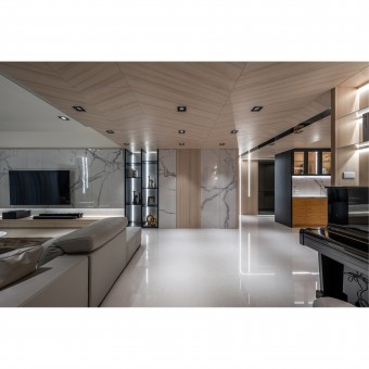
During the initial phases, the public and private areas were rationally distributed and the flow of space was sorted out according to the clients needs. The most critical concept was to use a row of double-sided cabinets to subtly divide the corridor-shaped entryway and the compounded dining and kitchen area. On one hand, there is a flow of space that has plenty of turns; and on the other, there is also plenty of storage mechanisms for the public area.
OPERATION / FLOW / INTERACTION:
The living room, the island dining area and the kitchen share the same depth of field and complementary functions on the same axis. The TV wall is made of custom made stone patterned melamine and a large amount of storage is built into the wall. The non-repeating texture of stone like material is one of the main features as its glossiness and ease of cleaning are particularly pleasing. The stone pattern that is scattered across the public area is consistent with the other materials used and allows the design concept to be conveyed more profoundly.
PROJECT DURATION AND LOCATION:
The project finished in Jun. 2021 in Kaohsiung City, Taiwan.
FITS BEST INTO CATEGORY:
Interior Space and Exhibition Design
|
PRODUCTION / REALIZATION TECHNOLOGY:
Having noted that there are beams crossing the center of the public area and above the corridor, the transition area from the entryway to the living room and dining room all the way to the corridor is twilled with extremely fine veneer. The method of joint and partially descending floors to highlight the staggered ceilings of different areas and the comprehensive setup is also quite thoughtful. In addition to integrating the air-conditioning equipment, recessed lighting and light strips, the living room and dining room both have rounded and white ceilings to elevate the field of vision and virtually achieve a smooth transition into defining the areas.
SPECIFICATIONS / TECHNICAL PROPERTIES:
This space is 182 square meters
TAGS:
Interior Design, Residential, Living space, Home, Residence
RESEARCH ABSTRACT:
The entryway has a large black mirror on the wall with two practical high cabinets and delicate linear light strips that move from the top to the bottom satisfying the need for large capacity storage, refrigerator placement and flow guidance all at the same time. Meanwhile, the reflections of the lighting and shadows are employed to eliminate the sense of closure from the corridor and the custom made stone patterned panels at the end of the corridor are used to beautify the two-way cabinets and also have a cleansing and focusing effect on the horizontal line of sight after entering through the door.
CHALLENGE:
The double arced ceilings in the living room and dining area and the wooden spliced ceilings between the entryway and the corridor are highly difficult tests of craftsmanship. The front edge of the corridor is set back using the wall line of the girls room and without affecting the sense of space, a storage area and a piano area were added while also cleverly shortening the length of the corridor. The asymmetrical shape of the headboard of the master’s bedroom not only uses different materials and contrasting colors, as the left side of the headboard can also decorate the original window.
ADDED DATE:
2022-06-27 20:26:30
TEAM MEMBERS (1) :
Wei Wang
IMAGE CREDITS:
Ar Her Kuo
|


