DESIGN NAME:
Dewy Glow
PRIMARY FUNCTION:
Commercial Space
INSPIRATION:
This project is a scalp care and hair care clinic and design theme with 'water' and 'light'. Water nourishes the earth and combines with light to create vitality, echoing aesthetic medicine's philosophy of pursuing natural beauty. The design team used light colors to present the crystal-clear water imagery and used mirrors, silver metal, and stone patterns to create a bright atmosphere. The corridor ceiling is made of water ripple patterned materials, by adding lighting helps create a dynamic duo of light and shadow that changes and integrates the natural elements into the space.
UNIQUE PROPERTIES / PROJECT DESCRIPTION:
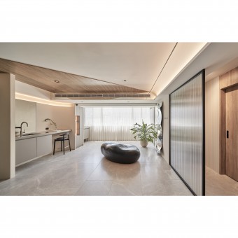
The aisle is designed as a stainless-steel panels arch to embed indirect lighting and different lighting throughout the day. The silver color of the stainless-steel panels is illuminated by the lighting and its concave and convex texture refracts to create light and shadow transformations. The glass facade and wall decorations are also related to the image of water ripples. The transparent glass with ripples divides the space and brings in the theme of 'water' and the image of daylight, which is also decorative. Meanwhile, the wall decorations are made by a special technique to create water ripples, giving the space a fluid effect.
OPERATION / FLOW / INTERACTION:
The design team used reflective mirrors to create an elongation effect in the interior, making the space looks taller and wider than it is. Meanwhile, the large windows in the reception area provide ample light, allowing for a panoramic view of Taipei 101. As well as the stone-shaped chairs, the natural elements such as water and light can alleviate the tension and pressure of waiting, as if visiting a finely crafted art museum. Different from other areas, the restrooms are decorated in dark colors to present the darkness of nature.
PROJECT DURATION AND LOCATION:
The project finished in March 2022 in Taiwan.
FITS BEST INTO CATEGORY:
Interior Space and Exhibition Design
|
PRODUCTION / REALIZATION TECHNOLOGY:
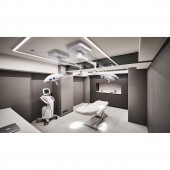
Building materials, wall cloth, mineral paint, stainless steel corrugated panels, water ripple patterned glass, wood veneer, melamine, artificial stone, etc. The operating room is made of artificial stone to reduce joints, while the cabinet is made of scratch-resistant, water-resistant, and high-temperature-resistant melamine, both are building materials with small pores to keep the surface free from bacteria and dirt to meet medical compliance. Mineral paint is used throughout the space, while the zero-formaldehyde veneer is for ceilings, aisles, and cabinets.
SPECIFICATIONS / TECHNICAL PROPERTIES:
The project covers 148.7 square meters and is divided into a reception area, a product experience area, a doctor room, two operating rooms, two restrooms, and a VIP lounge. The entrance is demarcated by arch-shaped light stripes, followed by a corridor with a stainless-steel corrugated ceiling that forms a transition of light and shadow to the grille facade, leading customers to the reception area. The open-plan layout of the reception area and product experience area allows customers to wander freely.
TAGS:
Light and shadow reflection, natural elements, metal, bright and airy, water,
RESEARCH ABSTRACT:
Each area has its function, and the style follows the theme of nature, showing endless vitality. The design team emphasizes the water ripples in this project, using light colors or lines to transform water ripples into a relaxed and harmonious existence. In addition, mirrors, metal panels, bright wood, and stone, along with water and light, creates a diverse look and a bright and delicate atmosphere. The stainless-steel aisle with a water-ripple patterned ceiling is based on the concept of 'photosynthesis', where water and light intertwined changes in light and shadow.
CHALLENGE:
The design team used the concept of 'water' and 'light', the most challenging part of this concept was to create dynamic abstract elements that would blend with the various building materials and areas. The design team used water ripples as the core, together with light-colored wood and line arching to avoid visual fatigue. In the end, the design strikes a balance between complexity and simplicity which complements each other.
ADDED DATE:
2022-06-27 09:11:18
TEAM MEMBERS (1) :
Fu-Cheng Chou
IMAGE CREDITS:
Palladio interior design
|


