The Cave Interior Design by Kiaro Interior L.T.D |
Home > Winners > #142443 |
 |
|
||||
| DESIGN DETAILS | |||||
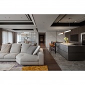
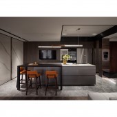
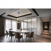
| DESIGN NAME: The Cave PRIMARY FUNCTION: Interior Design INSPIRATION: The original goal to combine art with life drew inspiration from the paintings of "Zao Wou-Ki" the colors, strokes, and structure of spatial color rendering and materials matching. A proposal for high-quality and more customized comfortable lifestyle was added through a keen sense of art, familiarity with materials science, exquisite craftsmanship with an attention to details and multiple advanced digital technologies such as the comprehensive integration of kitchen’s automatic doors. UNIQUE PROPERTIES / PROJECT DESCRIPTION: This project is a new single-story residential plan with an indoor area of approximately 165 square meters. The client’s members that are living at the house are quite simple: they pay attention to the quality of life, the specialness and functional details and sometimes have parties, gatherings as those are the needs that need to be considered. The distribution is user-friendly and accurate, and makes good use of the high-floor advantage of continuous large windows for lighting. OPERATION / FLOW / INTERACTION: A large mirror is placed on the wall in the entryway for people to tidy themselves up and absorb lighting. One side of the entryway has a tall cabinet and a titanium shoe-wearing area and the screen directly enters the line of sight in the central island snack area. In addition, an obsidian-framed screen is created to direct the flow into the public area. Using the stone screen's horizontal extension as a boundary, the differences in the color, temperature and properties of the marble and wooden floors consider the issues of practicality, comfort, texture and design taste to clearly define the primary flow and areas of activity. PROJECT DURATION AND LOCATION: The project finished in Dec. 2021 in Taipei City, Taiwan. FITS BEST INTO CATEGORY: Interior Space and Exhibition Design |
PRODUCTION / REALIZATION TECHNOLOGY: In view of the huge beam passing through the center of the public area, in order to take into consideration the optimum clearance height and eliminate the pressure under the beam. The design uses classic black and white lines with contrasting thicknesses and stacking to create partitioned ceiling blocks. However, each independent block adds additional changes in details such as the treatment of the sloping dome above the dining table subtly narrows the width of the original beam. SPECIFICATIONS / TECHNICAL PROPERTIES: This space is 180 square meters. TAGS: Interior Design, Residential, Living space, Home, Residence RESEARCH ABSTRACT: Space must serve people, and the "people" and "furniture" CHALLENGE: The central island snack area is a unique combination of a high table and bar counter that offers a variety of different ways to enjoy meals and behind it is a series of powerful home appliance cabinets and audio-visual walls. The implementation is based on the integration of the height difference of two sides of the huge structural column and is a telling test to the design team’s practical experiences. ADDED DATE: 2022-06-26 21:13:13 TEAM MEMBERS (5) : Hsieh Chia-Wei, Hsieh Chia-Hsuan, Shie Chi-Yu, Hsieh Yu-Chu and Chung Li IMAGE CREDITS: Penny |
||||
| Visit the following page to learn more: https://www.facebook.com/kiaro.interior | |||||
| AWARD DETAILS | |
 |
The Cave Interior Design by Kiaro Interior L.t.d is Winner in Interior Space and Exhibition Design Category, 2022 - 2023.· Read the interview with designer Kiaro Interior L.T.D for design The Cave here.· Press Members: Login or Register to request an exclusive interview with Kiaro Interior L.T.D. · Click here to register inorder to view the profile and other works by Kiaro Interior L.T.D. |
| SOCIAL |
| + Add to Likes / Favorites | Send to My Email | Comment | Testimonials | View Press-Release | Press Kit | Translations |
Did you like Kiaro Interior L.t.d's Interior Design?
You will most likely enjoy other award winning interior design as well.
Click here to view more Award Winning Interior Design.


