DESIGN NAME:
China Merchants
PRIMARY FUNCTION:
Bank Store Identity
INSPIRATION:
In classical Chinese architecture, the window is often denoted by a square, which symbolizes security and stability. This geometric shape is conducive to building trust and maximizing space utilization, which provides inspiration for the identity design of the branch. Therefore, this project takes the square as the architectural core and the visual focus to build a reliable image, thus conveying its openness and friendliness to customers in both visual and mental ways.
UNIQUE PROPERTIES / PROJECT DESCRIPTION:
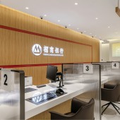
This is a new modernized branch for China Merchants Bank, whose design language is themed on technology and humanity. Based on the concept of openness and inclusiveness, both the materials and the design techniques adopted show affinity to bridge the estrangement between customers and the interior space. To highlight the basic service attributes, it is divided into several functional areas to cover various usages, making it a place for daily socializing and leisure, rather than just trading.
OPERATION / FLOW / INTERACTION:
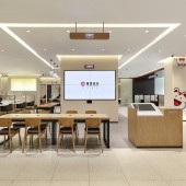
The interior moving lines are optimized via a new spatial layout. As a distinctive signature of the project, the integrated rest area at the front lobby impresses customers with a friendly image at the very first sight, which contributes to higher brand memorability. This area also satisfies the needs for guidance, rest and service to improve customer experience and bridge the gap between customers and the interior environment, thereby enhancing user viscosity and attracting more customers.
PROJECT DURATION AND LOCATION:
The project design started in June 2020, and the construction was completed in Shenzhen, China in February 2021.
FITS BEST INTO CATEGORY:
Interior Space and Exhibition Design
|
PRODUCTION / REALIZATION TECHNOLOGY:
Lighting, colors and materials are important to the interior visual effect. The project combines wood, leather, glass and lighting harmoniously, paired with the black borders and the contrasting brand colors, to create a cozy and soothing ambiance. In the detail design, the grains of wood and leather adopted exude a special tone, which echos the lighting of 5500K color temperature to form a relaxing space for people to enjoy communication, thus interpreting the theme of technology and humanity.
SPECIFICATIONS / TECHNICAL PROPERTIES:
870㎡
TAGS:
Store Identity Design, Functionally Based Space Division, Openness and Inclusiveness, The Design Language Combining technology, humanity and future
RESEARCH ABSTRACT:
Banks are often taken as the places offering only financial services. Thediverse public needs drive banks to diversify service chains. This project takes a leap in the bank identity design to refresh customers via the innovative design that integrates technology, life and financial services. It stresses the social and service attributes, aiming to standardize the branches different in layouts, sizes and levels while retaining their individual characteristics via modular design.
CHALLENGE:
The project combines many functional areas such as business reception, waiting and entertainment, all of which radiate from the central integrated rest area. It not only marks the transformation of a modern bank branch to an intelligent, ecological and cosy one, but also represents the innovative application of the futuristic high-tech design style. By shedding the serious and stiff stereotype of the traditional reception desk, it injects more humanized and leisure touch into the whole space.
ADDED DATE:
2022-06-24 05:53:50
TEAM MEMBERS (5) :
Wendong Zhou, , LEE YOUNGBIN, , Jingfan Chen, , Shuidong He, and Qilin Yang
IMAGE CREDITS:
Shenzhen Scene Aesthetic Design Co., Ltd, 2022.
|


