DESIGN NAME:
Line and Structure
PRIMARY FUNCTION:
Residential
INSPIRATION:
The clients family consists of ten members from three generations. Inspired by the warm atmosphere of this large family, the design team used the three elements of light, shadow, and line according to the characteristics of the building to create independency for the public and private areas. In the end, the design team created a separate space for each person, while connecting the close living and interaction between family members to build the ideal home.
UNIQUE PROPERTIES / PROJECT DESCRIPTION:
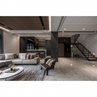
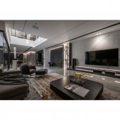
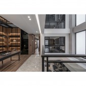
The design team connects different materials and changes of light and shadow to create a majestic and smooth design. The low saturation colors reveal a calm and quiet atmosphere, complemented by various metal embellishments, which gently lay out the texture and atmosphere. The space is designed with vertical and horizontal lines to explore the connection between family members. In the open plan, the vertical and horizontal lines can lead the visual extension, invoke natural light upward, converge downward to connect the public area on the second floor and connect the private area on each floor horizontally to make the home warmer.
OPERATION / FLOW / INTERACTION:
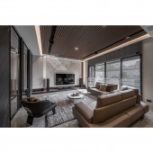
The long and narrow layout affects the vision and feeling. To avoid the feeling of oppression, the design team used light, shadow, and lines in the space. Especially in the study areas on the 3rd and 4th floors, the diffuse light and shadow stretch the vertical axis of the space, invisibly leading the visual extension upward. The design team used precise lines to decorate the environment so that clients can feel the varied elements of the design no matter where they are.
PROJECT DURATION AND LOCATION:
The project finished in January 2022 in Taiwan.
FITS BEST INTO CATEGORY:
Interior Space and Exhibition Design
|
PRODUCTION / REALIZATION TECHNOLOGY:
The client prefers the natural texture of stone, and therefore the design team adopts imported Neolith to replace marble in the main wall. When it comes to Neolith, it has three characteristics: first, it is made of 100% natural materials and can be recycled, second, its thickness is only 3mm, which has the same texture as stone with its thinness, third, the porosity of the material is less than 0.08%, which can effectively prevent the accumulation of bacteria and allergens. As for the paint, the project adopts Italian eco-friendly mineral paint.
SPECIFICATIONS / TECHNICAL PROPERTIES:
The project has 991.7 square meters, with 5 floors and a single floor area of 198.3 square meters. There are 8 rooms, a dining room, a living room, and 4 social halls. In terms of function, the 1st and 2nd floors are public areas, the 1st floor has a garage and a social hall, and the 2nd floor has a living room, a restaurant, a cooking area, and a light meal area. The 3rd to 5th floors are private areas, the 3rd and 4th floors have a social hall, a study room, a master bedroom, and two childrens rooms, the 5th floor has a Buddhist hall, a parents' room, and a guest bedroom.
TAGS:
Patio, large area, single-family house, light and shadow, lines.
RESEARCH ABSTRACT:
The interplay of light between the vertical and horizontal axes allows for the visual extension of the long and narrow layout. The low saturation of color blocks outlines the refinement of the environment. The changes in light and shadow enrich the interior yet create an artistic expression. The design team uses light, shadows, and, lines to construct the visual in the space thus named this project 'Between line and structure.' The whole space preserves the privacy of each family in the private area while maximizing the interaction of each family member in the public area.
CHALLENGE:
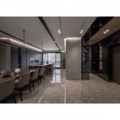
The project has five floors and a large space, so there are many beams and columns. In particular, the large beams on the first floor are the most noticeable. To solve the problem, the design team used dark stone veneer to cover the beams and columns and added wood panels to weaken the beam visually and increase lighting. To avoid the visual pressure caused by the uneven beams, the design team deliberately lowered the ceiling. However, to maintain a transparent view, the design team through the patio and lighting to guide the light, creating a harmonious and unobtrusive space.
ADDED DATE:
2022-06-24 05:16:29
TEAM MEMBERS (1) :
CHIUNG-YING CHIU, KENG-YAO CHANG
IMAGE CREDITS:
SAN.O INTERIOR DESIGN
|
