DESIGN NAME:
Peace of Mind
PRIMARY FUNCTION:
Residential
INSPIRATION:
In the hustle and bustle of urban life, finding a place to live close to nature and peace is the core of this space design. In contrast to other luxury houses, the large pavilion pursues a relaxing, tranquil, and undisturbed living experience. Through color, technique, and route planning, the designer creates a fresh atmosphere for the family to interact with nature and the mind. In other words, it is a place to get away from the city and enjoy the tranquility.
UNIQUE PROPERTIES / PROJECT DESCRIPTION:
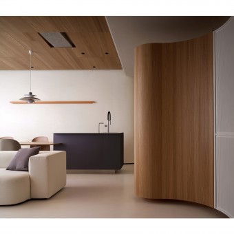
The whole space is based on the creamy white color that the hostess expects, and the texture of the handicraft is depicted by a special lacquer. In addition, the designer incorporated the curved shape in warm and quiet spaces, such as in the cabinets, beams, and doors. By replacing the traditional square lines with soft ones, the space is less in angles and creates an open visual experience. In addition, the space is embellished with coffee tones, stainless steel panels, Morandi-colored laminate, wood grain, and mirrors. In the creamy white, these elements create an elegant atmosphere of simplicity and tranquility.
OPERATION / FLOW / INTERACTION:
In spacious and airy space planning, the designer uses curved lines and surfaces to eliminate the angles of the space. On the one hand, the soft lines make it look smooth, and on the other hand, the curved shape makes the space break away from the traditional impression. As soon as the family moves in, they will feel like they are on vacation and can fully release their stress. Furthermore, the designer also used concealed doors to cleverly maintain the spacious feeling of the same tone. Finally, the beige special paint, wooden ceiling, and beams create a quiet and natural feeling.
PROJECT DURATION AND LOCATION:
The project finished in June 2021 in Taiwan.
FITS BEST INTO CATEGORY:
Interior Space and Exhibition Design
|
PRODUCTION / REALIZATION TECHNOLOGY:
Materials, Italian brown earth special paint, LED lights, PANDOMO flooring, stainless steel cabinet, color changing film, terrazzo, wood material, woodwork cabinet, concealed doors, special curved door piece, glass. The color changing film is on the facade where the TV wall meets the balcony and on the kitchen island of the restaurant so that the light will reflect a rainbow effect and give a different feeling to the experiencers when walking around the space.
SPECIFICATIONS / TECHNICAL PROPERTIES:
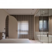
This project is a newly completed house with an area of 198 square meters, which can be divided into 132 square meters of indoor and 66 square meters of outdoor terrace. There are three bedrooms, a living room, and a dining room, and the client is satisfied with the layout. The living room and bathroom have double doors, which can access by both the public area and the master bedroom. The original four bedroom layout was converted into three bedrooms, allowing for more spacious space. On the other hand, the terrace has been arranged and planted to allow the family to relax in their leisure time, bringing cozy moments to their lives.
TAGS:
Curved smoothness, tranquility and comfort, open plan, minimalist.
RESEARCH ABSTRACT:
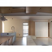
This project is a new house with perfect ceiling and floor condition. By transforming four rooms into three, the designer created more spacious spaces for families. At the same time, by taking advantage of the lighting, the large floor to ceiling windows, the ceiling, higher door pieces, and concealed doors, the space is shaped to be smooth and spacious. The theme of simplicity, tranquility, purity, and comfort is taken into consideration in advance. Meanwhile, the beige and white special lacquer and wooden tones reveal the elegant atmosphere of the modern Japanese house.
CHALLENGE:
In the ceiling and the entrance, the toilet was immediately visible when entering the door. Therefore, the designer used a special lacquered wall as a finishing touch, and at the same time, a circular approach to weaken the abrupt beams and columns. As for the low beams in the public area that cannot be eliminated, the designer made it an artistic design. Through the ingenious idea of painting gray, the abrupt beams perfectly integrated into the space through the color tone. In addition, through the color and curved shapes, the designer created a smoother traffic flow and renovated the configuration to satisfy the family's living habits.
ADDED DATE:
2022-06-24 03:50:26
TEAM MEMBERS (1) :
IMAGE CREDITS:
MOON SHAPE Interior Design
|


