DESIGN NAME:
Origami Science
PRIMARY FUNCTION:
Reception Center
INSPIRATION:
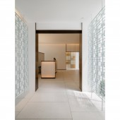
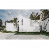
The project is based on a Green Field and extends upwards to create a space (origami) science. The reception center is located between the old houses and the greeneries. The design team observed the characteristics of white paper and stacked the geometric space through folding lines. The appearance of the building uses half-cut PVC pipes to present the appearance of paper after folding. The roof is symbolized by draped paper, stretching the pressed space between the branches of the park. The aisle connecting the white building uses Chinese paper-cut arts to evoke nostalgic memories.
UNIQUE PROPERTIES / PROJECT DESCRIPTION:
From the outside to the inside, there are three buildings with different functions, which are the introduction area, sales area, and sample house area. The three buildings are staggered, and the lightness of white is accentuated by the thinness of the paper. The design team used vintage Chinese paper-cut arts to link the three places and made the interior and exterior of the house according to the characteristics of the folded paper so that the reception center plays the role of presenting memories and imagining the future.
OPERATION / FLOW / INTERACTION:
In order to reduce the usage of light fixtures, the design team focused on the lighting part. The design team made the facade facing the park fully light-transmitting, and the material transition allows the interior to enjoy the sun and breeze while retaining privacy. Moreover, the aisle also adopts a penetrating method to arouse the curiosity of people outside the building. The exterior of the reception center uses two design elements, white and curved, to simulate a paper look. This ingenuity gives the whole work a bright atmosphere from the inside to the outside.
PROJECT DURATION AND LOCATION:
The project started in December 2021 and finished in March 2022 in Zhongshan District, Taipei City.
FITS BEST INTO CATEGORY:
Interior Space and Exhibition Design
|
PRODUCTION / REALIZATION TECHNOLOGY:
This project has three sides facing the road and one side facing the park. The design team has oriented the largest light-transmitting facade towards the park. The upper part of the building uses an expansion grid to achieve light penetration, allowing the sunlight, treetops, and sky scenery to be kept inside while achieving good ventilation. On the other hand, the middle part of the building uses striped curtains, echoing the lines of the walls and floors.
SPECIFICATIONS / TECHNICAL PROPERTIES:
The total space of this project is 208 square meters, with 66 square meters for the project introduction area, 99 square meters for the reception area, and the rest of the space for the aisle and toilets. In terms of materials, no natural stone was used. The exterior walls are semi-painted with PVC pipes, and the interior flooring is made of artificial terrazzo tiles. At the same time, gold elements are used for the wood paneling, expanded mesh, glass, and paper-cut arts left over from the old building. Meanwhile, the cabinets are made of flexible and tough honeycomb paper.
TAGS:
White paper, origami, white, curved, park.
RESEARCH ABSTRACT:
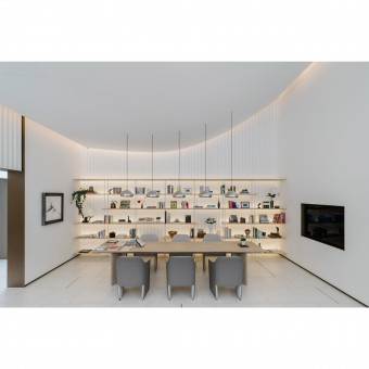
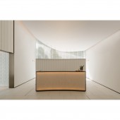
Spatial (Origami) Science is a space used as a reception center, and its appearance resembles white paper. Paper-liked, the roof span is large enough to give the impression of falling downward by gravity. Not only the appearance of the building, but the concave and convex art of origami also extends to the interior. The ceiling is about five meters high with a nice clean curved side. The design team simply used the seam removal technique and ambient lighting to make the curved lines diffuse warm light around, revealing the extraordinary texture.
CHALLENGE:
With the park as an extension of the concept and the imagery of white paper, the design team had to overcome two difficulties. First, in order to integrate with the natural environment, the design team removed a large number of lighting fixtures. In the space with a height of about five meters, the design team used large areas of light-transmitting materials and a partition-free design to bring natural light into the room. The second is how to present the softness of white paper in the architecture, which challenges the design team's observation of paper and aesthetic sensitivity.
ADDED DATE:
2022-06-22 08:22:51
TEAM MEMBERS (1) :
Jheng-Syuan Hong
IMAGE CREDITS:
Shiuan Hong Architects
|


