DESIGN NAME:
Lines Geometry
PRIMARY FUNCTION:
Residential
INSPIRATION:
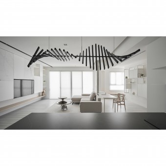
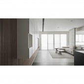
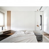
The hustle and bustle of the city are isolated from the house. The designer uses eco-friendly plaster on the ceiling and walls to create a minimalistic space with a tranquil atmosphere that calms the mind. The axis of the corridor divides the field invisibly, and the contrasting color tones form different attributes of gray and white, creating a unique visual experience.
UNIQUE PROPERTIES / PROJECT DESCRIPTION:
The plaster is hand-painted on the ceiling and walls, and the layers are like clouds, giving the space a sense of texture in an orderly manner, which creates a calm and quiet space. The designer uses straight lines to curved lines, single lines to arrays, geometric lengths, square correspondences, and staggering to create layers and uniqueness.
OPERATION / FLOW / INTERACTION:
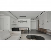
The black shelf below the TV cabinet can not only store books and accessories but also extend to the doorway as a shoe chair, which is completely designed from an aesthetic and practical perspective. The dining table and desk are also composed of lines and geometry, making the whole space integrated.The shoe cabinet, TV cabinet, black iron shelve, bookshelf, and bedroom can be regarded as boxes of different sizes and distributed in public areas such as restaurants and living rooms.
PROJECT DURATION AND LOCATION:
The project finished in August 2021 in Taiwan.
FITS BEST INTO CATEGORY:
Interior Space and Exhibition Design
|
PRODUCTION / REALIZATION TECHNOLOGY:
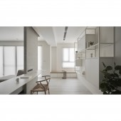
The TV cabinet and the black iron chased display shelve are designed with suspension and volume contrast. Besides, the texture of the dolomite brick is like clouds, and the space between them shows a sense of visual continuity. Last but not least, the designer combines the bookcases in red, yellow, and blue with a black iron shelve, which looks like a large painting by Piet Mondrian and have both display and practical functions.
SPECIFICATIONS / TECHNICAL PROPERTIES:
The designer is inspired by the box and combines the idea with practicality to plan the place. The storage room is like a box hidden in the space, with a powerful storage function, and also serves as a display wall for the entrance.
TAGS:
White, Calmness, Brightness, Comfort, Natural greenery
RESEARCH ABSTRACT:
Simplicity brings calmness and tranquility to the space, while lines outline the visual sense of the field, and colors embellish the interest of life. The designer uses pure linearity and geometry as the structure and creates a different visual experience with the visual flip of the rectangular geometry. The plaster is hand-painted on the ceiling and walls, and the layers are like clouds, giving the space a sense of texture in an orderly manner.
CHALLENGE:
White is used as the base color, together with the white and black of the cabinet and the red, yellow, and blue of the iron shelve. The base color of the dining room is gray, with the black of iron and blue of paintings, white and black stone textures, and furniture. The designer creates a beautiful and harmonious style by combining geometry, suspension, penetration, and simplicity are used to present beauty.
ADDED DATE:
2022-06-22 06:29:38
TEAM MEMBERS (1) :
Zong-Ying Chen
IMAGE CREDITS:
Zong Ying Chen, 2022.
|
