DESIGN NAME:
Noble 16 Zhenxuan
PRIMARY FUNCTION:
Packaging
INSPIRATION:
The packaging follows the classic bottle shape of Baijiu to continue the product identity and show the charm of the East and a sense of time precipitation, arousing a spiritual resonance with local consumers. Designed based on fashionable western mixology, the flowing lines and reliefs lead to a vigorous modernity to satisfy the taste of western users. The design team well blended two cultures in sharp contrast to convey a harmonious beauty, helping to form an exclusive symbol of this product.
UNIQUE PROPERTIES / PROJECT DESCRIPTION:
This premium liquor packaging aims to convey the blended methods of the East and the West contained in the product to users via the international and modern design. The design team utilized classy materials and technologies to perfectly integrate traditional Chinese Baijiu culture and fashionable western elements, thereby providing a multisensory experience for users. Such a design enables the packaging to boast a smooth texture with a sense of light luxury and a high collection value.
OPERATION / FLOW / INTERACTION:
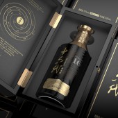
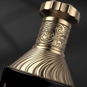
The round and smooth black-glazed ceramic body combined with the flowing and abstract reliefs and lines on its surface gives a more layered experience of grip and touch. The pattern on the bottleneck draws inspiration from Chinese composite flowers and western scroll grass, visually conveying charm of the product blending Chinese and western cultures. Via rigorous information layout and color contrast, the classy label increases fun of reading for users.
PROJECT DURATION AND LOCATION:
The project began in Jingdezhen City in December 2021 and was completed in Jingdezhen City in February 2022.
FITS BEST INTO CATEGORY:
Packaging Design
|
PRODUCTION / REALIZATION TECHNOLOGY:
The black-glazed ceramic body brings about a strong sense of time precipitation. The lines carved through the western relief technology strengthen the modernity of the product, forming a sharp contrast to the historical sense of the body. The golden and dark patterned paper applied in the label offers users a classy visual and tactile experience.
The outer painted wooden box adopts leather-like mounting supplemented with the gold stamping process to elevate the collection value of the product.
SPECIFICATIONS / TECHNICAL PROPERTIES:
148*120*280mm
TAGS:
Liquor, wine, package design
RESEARCH ABSTRACT:
The black and gold color matching paired with the golden liquor label visually presents the quality of the product, helping to gain user trust. The inside page of the outer painted box introduces the concept of the flavor wheel that is from the flavor structure of the West, which achieves visual flavor description. In this way, a design idea of professionalism and rigour is reflected so that the product can be well accepted by users.
CHALLENGE:
Considering the product positioning, the packaging needs to create a recognizable cultural symbol to ensure the product can be accepted by both local users and western consumers. Refining traditional Baijiu culture and controlling western mixology presented, the designer team made a compromise between Chinese and western liquor culture to realize perfect blending of different culture, interpret the blended methods contained in the product and create an exclusive symbol of this premium liquor.
ADDED DATE:
2022-06-11 06:07:09
TEAM MEMBERS (2) :
HN LIU and FANG TAI
IMAGE CREDITS:
Jingdezhen Jiushan Creative Co., Ltd., 2022.
|


