Koch's Meerrettich Rebranding by Wolkendieb Design Agency |
Home > Winners > #140491 |
 |
|
||||
| DESIGN DETAILS | |||||
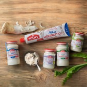
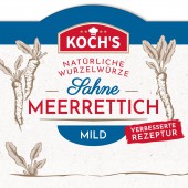
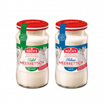
| DESIGN NAME: Koch's Meerrettich PRIMARY FUNCTION: Rebranding INSPIRATION: KOCH's is a subsidiary brand of the Develey-Group, one of the strongest international companies for mustards, sauces and dressings. Local production and national sales are particularly driving its popularity. Since the family business was founded more than 100 years ago, KOCH's has been cultivating its own fields, conducting its own plant research on cultivation, storage and gentle processing in the production lines. The task was to reflect this quality and naturalness on the labels. UNIQUE PROPERTIES / PROJECT DESCRIPTION: The motto "back to the roots" is currently conquering the food industry. Ancient root vegetables, which include horseradish, are currently very popular. This trend is taken on the successfully relaunched KOCH's products. The new design doesn't focus on depicting the dishes, but rather the unprocessed illustrated ingredients. Fresh from the field - directly, simply and lovingly prepared! OPERATION / FLOW / INTERACTION: To match the brand relaunch even more, the recipes were reworked to become even cleaner, without any additives or conservatives. PROJECT DURATION AND LOCATION: The project started in March 2021 in Aachen, Germany and finished in July 2021. It is displayed on shelves since November 2021. It was showcased in the 196th issue of the "Creativ Verpacken". FITS BEST INTO CATEGORY: Packaging Design |
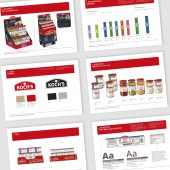
PRODUCTION / REALIZATION TECHNOLOGY: The logo was relaunched first. From there, the shape of the labels has been adapted to the new identity. A freshness and quality has been created. All labels are printed on natural uncoated paper. SPECIFICATIONS / TECHNICAL PROPERTIES: Jars with natural paper labels in various sizes are sold in retail. The relaunch also includes a aluminium tube and the entire catering range with large plastic containers. Each recipe has its own illustrations and colour-code. In order to put forward the products top-freshness, a freshness and quality seal has been created. The intensity-level is indicated by a scale. TAGS: packaging, brand image, rebranding, WOLKENdieb, Develey, KOCHs, horseradish, logo RESEARCH ABSTRACT: Before the project started, a market research analysis was conducted to reveal the weaknesses of the brand, and how it should be upgraded. After the brand and product relaunch, a new market research was successfully conducted, and showed how well the rebranding works on the consumers. CHALLENGE: The challenge was to give KOCH's brand a new look that would appeal to younger and new customers, without losing existing customers. The design had to reflect the naturality and simplicity of each "like-before recipes" ADDED DATE: 2022-03-30 14:04:22 TEAM MEMBERS (4) : Creative Director: Annika Reuber, Art Director: Daskia Frohn, Art Director: Chloe Krey and Technical Artworker: Margit Jansen IMAGE CREDITS: Wolkendieb Design Agency, 2021. |
||||
| Visit the following page to learn more: http://www.wolkendieb.com | |||||
| AWARD DETAILS | |
 |
Koch's Meerrettich Rebranding by Wolkendieb Design Agency is Winner in Packaging Design Category, 2021 - 2022.· Read the interview with designer Wolkendieb Design Agency for design Koch's Meerrettich here.· Press Members: Login or Register to request an exclusive interview with Wolkendieb Design Agency. · Click here to register inorder to view the profile and other works by Wolkendieb Design Agency. |
| SOCIAL |
| + Add to Likes / Favorites | Send to My Email | Comment | Testimonials | View Press-Release | Press Kit | Translations |
Did you like Wolkendieb Design Agency's Packaging Design?
You will most likely enjoy other award winning packaging design as well.
Click here to view more Award Winning Packaging Design.


