Hand Made Nanning Mixc Store by Denver Hsu |
Home > Winners > #139996 |
 |
|
||||
| DESIGN DETAILS | |||||
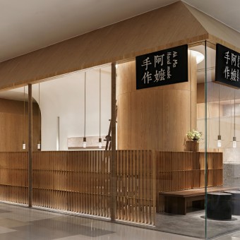
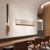
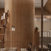
| DESIGN NAME: Hand Made Nanning Mixc PRIMARY FUNCTION: Store INSPIRATION: On the birdsong tree, when the sun shines on the eaves, grandma's eaves are not only a place to shelter from the wind and rain, but also an old friend who quietly accompanies you through every time. Amidst the bustling hustle and bustle, there is a touch of tranquility and tranquility. This is a kind of temperament, but also a kind of self-cultivation. The leisure time in the metropolis will be redefined here. UNIQUE PROPERTIES / PROJECT DESCRIPTION: The designer of this project brings the eaves back to the public,thinking of extending the artistic conception of the old fashioned flavor,the full open cooking is adopted in the layoutfor the first time,that makes the cooking area delectable and authentic. So the customers can feel the traditional cooking technology when they enjoy their drinks. OPERATION / FLOW / INTERACTION: The design team pays special attention to the interaction between space and people in the design. The spacious and bright sense of space expresses the relationship between spaces with natural textures and building block techniques. The screen in the middle curve greatly changes the compositional relationship between the existing space and other spaces, enriches the light and shadow of the entire space, and enhances the sense of space. A new flow is established between places. PROJECT DURATION AND LOCATION: The project started in July 2020 in Nanning and finished in October 2020 in Nanning. FITS BEST INTO CATEGORY: Interior Space and Exhibition Design |
PRODUCTION / REALIZATION TECHNOLOGY: The space makes full use of the characteristics of the site,reference to the cylinder,screen and hanging shape are combined to make the site interesting and clever. SPECIFICATIONS / TECHNICAL PROPERTIES: The project covers a total of 130 square meters. The interior space is divided into fo different space: dining space,Kitchen,Electr TAGS: Interior, Commercial, New Tea, Chain Store, Cool, Pure, Asian style. RESEARCH ABSTRACT: In the overall design, we have simplified the complexity, and laid the foundation for the quality assurance in terms of exquisite workmanship, elegant hardware, and surface materials. In terms of color, simple and rustic light wood color is used with gray natural marble, and white is used as the keynote of the scene, omitting the flashy, with a touch of elegance, reshaping the space of memory. CHALLENGE: Quiet, generous, and no sense of distance are the space atmosphere we want to create, but the natural feeling it presents highlights its unique characteristics. In the expression of texture, as always, I prefer the most basic material relationship. Logs, washed stone, paint. Bronze has become the protagonist of the space this time. ADDED DATE: 2022-03-26 07:17:52 TEAM MEMBERS (2) : Xiao Wei Zhou and Qiya Lu IMAGE CREDITS: Copyrights belong to Sense Space, 2020. PATENTS/COPYRIGHTS: Copyrights belong to Denver Hsu, 2021. |
||||
| Visit the following page to learn more: https://goo.gs/ghpz4 | |||||
| AWARD DETAILS | |
 |
Hand Made Nanning Mixc Store by Denver Hsu is Winner in Interior Space and Exhibition Design Category, 2021 - 2022.· Read the interview with designer Denver Hsu for design Hand Made Nanning Mixc here.· Press Members: Login or Register to request an exclusive interview with Denver Hsu. · Click here to register inorder to view the profile and other works by Denver Hsu. |
| SOCIAL |
| + Add to Likes / Favorites | Send to My Email | Comment | Testimonials | View Press-Release | Press Kit |
Did you like Denver Hsu's Interior Design?
You will most likely enjoy other award winning interior design as well.
Click here to view more Award Winning Interior Design.


